Pure Miriam
Legendary Comrade
Shardbinder
 [TI1] "A new, vital heart, pulsing with the old blood." -IGA
Posts: 1,068

inherit
Legendary Comrade
445
0
Oct 20, 2019 3:32:00 GMT -6
1,600
Pure Miriam
[TI1] "A new, vital heart, pulsing with the old blood." -IGA
1,068
Jul 25, 2015 2:19:20 GMT -6
July 2015
puremiriam
|
Post by Pure Miriam on Jan 10, 2017 1:47:17 GMT -6
I completely agree with XombieMike and with CastleDan. I really don't understand how people look at the Village and say those are bad and ugly graphics. I respect other's people's opinions and i think constructive feedback is always important. And that is the same reason why i need to get my voice heard too and say that people are WAY over-reacting. I trust in IGA. Considering all the games he ever did in the Castlevania series, very few ever disappointed me, and not completely. Even the hated Castlevania: Judgment had it's hidden shine in my eyes. So, i'm pretty sure the team is doing a hard work and an awesome job at it. In IGA i trust. And to be really honest, if the game were to be released exactly like it is now, with the same gameplay as the Demo, with the added things we know they already decided (like the guns with ammo, leveling Shards and such), i'm sure i would be satisfied. Knowing that they probably are going to improve this even more, makes me even more eager for it. |
|
inherit
7
0
Jun 28, 2019 21:35:13 GMT -6
1,291
CastleDan
1,514
May 28, 2015 9:50:13 GMT -6
May 2015
castledan
|
Post by CastleDan on Jan 10, 2017 10:41:22 GMT -6
Honestly it's not that I'm even saying the graphics are drop dead beautiful either. What I'm saying is it looks visually in line with what the 2d games did, which is what I thought people wanted? A game that translates the 2d games into 2.5d well. I'm just confused as to what people expect visually, it's like they think this is a huge budgeted game or something with an incredibly big team. It's an indie title. Let's compare : 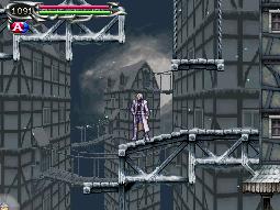 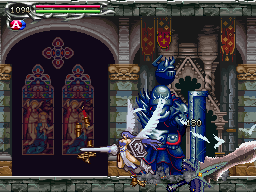 vs  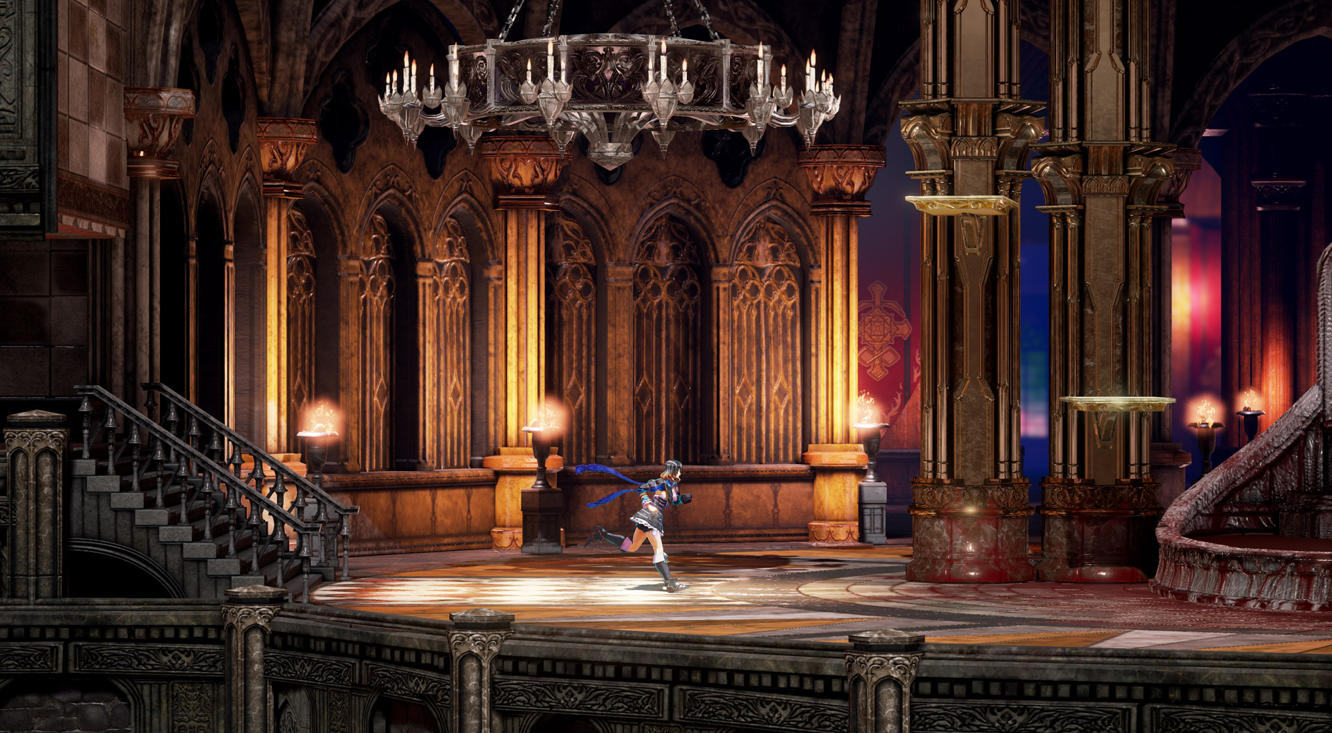 Try and tell me that doesn't replicate the 2d look and feel spot on? Now let's compare to other indie side scrollers : 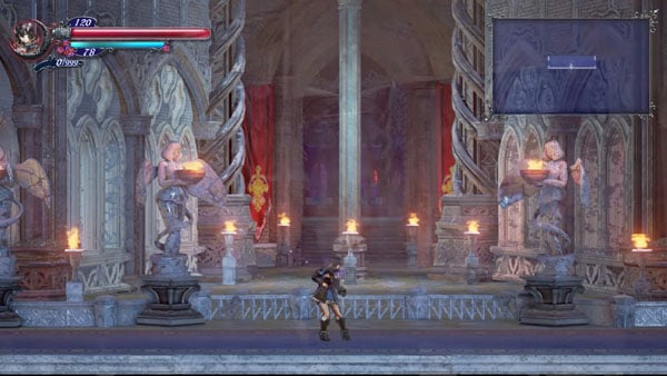  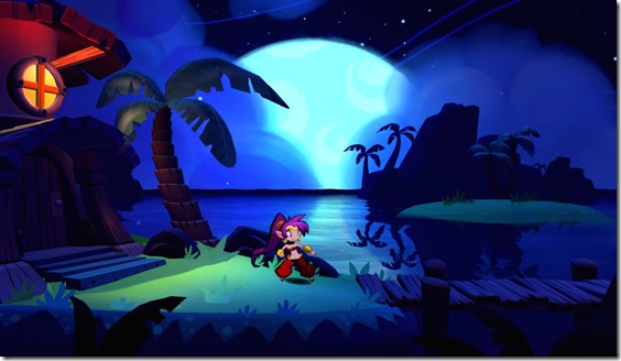  So please tell me how it doesn't compare well to Castlevania games in 2d and other indie games. |
|
purifyweirdshard
Administrator
Administrator  Calling from Heaven
Posts: 3,789
Staff Mini-Profile Theme: Example 2

inherit
Administrator
210
0
1
Nov 22, 2024 16:16:48 GMT -6
3,660
purifyweirdshard
Calling from Heaven
3,789
Jun 29, 2015 7:24:38 GMT -6
June 2015
purifyweirdsoul
Staff Mini-Profile Theme: Example 2
|
Post by purifyweirdshard on Jan 10, 2017 10:47:36 GMT -6
Oh and Dan, yeah, I miss the shader vote stage, too...but we're not actually sure that was/is the castle entrance. It could very well be fairly deep in, or like Astaroth said a later part of the entrance. As with SotN, the warg hallways look quite a bit different from the post-Death ones.
|
|
Enkeria
Silver in the Dark
Fifty Storms  Amzeer - Aurora of Rebirth
Posts: 1,908

inherit
Silver in the Dark
1757
0
Oct 27, 2024 12:45:42 GMT -6
1,287
Enkeria
Amzeer - Aurora of Rebirth
1,908
Nov 28, 2016 17:56:45 GMT -6
November 2016
enkeria
|
Post by Enkeria on Jan 10, 2017 13:12:08 GMT -6
I wish for another update video in the future from the same area, with all the current additions from the development. When, is not important, only that we get the same area once it have given a bit more polish.
|
|
inherit
925
0
Jun 6, 2018 19:05:04 GMT -6
94
GenericSoda
86
Dec 4, 2015 23:38:39 GMT -6
December 2015
genericsoda
|
Post by GenericSoda on Jan 10, 2017 13:47:42 GMT -6
The village is cool! If there were villagers there freaked out about the appearance of a castle that would be neat, but an abandoned village a la Rondo of blood is fine too!
The only thing I have to note about is that the wagon appears kind of weird as a platform. It doesn't really "pop" the same way that the awnings do.
|
|
inherit
Bad at Videogames
1737
0
Jan 11, 2020 19:31:27 GMT -6
24
spanishvanguardia
30
Oct 12, 2016 9:20:09 GMT -6
October 2016
spanishvanguardia
|
Post by spanishvanguardia on Jan 10, 2017 14:01:10 GMT -6
It feels like area lightning isn't porperly implemented yet. I just hope it's part of the map development process and that the overall look of the scenario will be touched upon.
Watch-ability will give the game a spot on the streaming scene. But as it stands right now... I dunno. Was a port for 3ds one of the stretch goals? Because it looks like it could look nice with the 3d view mode.
Other than that, I expect the finished product, or at least an update not too far from scheduled launch, will make the game more visually obvious.
|
|
Jango
New Blood

Posts: 72
inherit
509
0
Oct 19, 2018 19:35:22 GMT -6
104
Jango
72
Aug 4, 2015 13:00:30 GMT -6
August 2015
jango
|
Post by Jango on Jan 10, 2017 19:27:26 GMT -6
Bloodstained looks very good. Iga and his team, and most Kickstarter games, cant help but invite scrutiny so that's exactly what people give them. Which bits are constructive or not are for the devs to decide.
I think Iga and his team have shown they have sharp instincts thus far and by the time the game is released it'll be a great, well polished package.
Ooh, check out the new Shinobi up there. I'm gonna go play that again.
|
|
inherit
1109
0
Jul 23, 2017 17:51:04 GMT -6
12
earthfield
10
Jan 29, 2016 16:20:25 GMT -6
January 2016
earthfield
|
Post by earthfield on Jan 11, 2017 4:32:10 GMT -6
earthfield thanks for taking the occasional step out of the shadows to voice an opinion. I particularly interested in how you are excited and think the game is going in the right direction. I cannot stress that enough! And I should clarify that I don't have much issues with the graphics per se, but the shading. It looks so bleached like I said and bland, and I get making it vibrant is not very realistic, but neither were any of the previous titles. Let's look into the concept art again; and no, this is not a"let's go make a 2D game" We were there enough times already. But look at this again.  Again, it's concept, but look at the colours, I can only hope they get closer to this. We can argue the castle may be different, but if you look at the hallway video shown last time, we can see it looks nothing like this.  And this goes with what I said before, about the Unreal shading and stuff, but some other people worked with unreal and managed to do their own stuff, and I'm hoping a game that got over 5 times it's supposed needed budget does the same. And I hear you, the budget goes into a lot of things, they're gonna add to enrich the game, but still, lot of people, veteran developers and not so much got really impressive stuff. I feel like I'm harping on it too much, I don't mean to bring anyone down with this, but I cannot avoid feeling concerned about this, and I don't see many sharing my thoughts. I am still glad I backed this, and I sure want to see this grow bigger and better, like all of you, so I hope you don't take my complains to heart if you disagree. -Cheers |
|
Kale
New Blood

Posts: 83
inherit
1687
0
May 15, 2017 13:22:25 GMT -6
43
Kale
83
Jul 30, 2016 0:01:31 GMT -6
July 2016
kale
|
Post by Kale on Jan 11, 2017 4:46:04 GMT -6
I think 5 times over budget is wrong... it's 5 times over the original budget but stretch goals aren't included in such.
|
|
Jango
New Blood

Posts: 72
inherit
509
0
Oct 19, 2018 19:35:22 GMT -6
104
Jango
72
Aug 4, 2015 13:00:30 GMT -6
August 2015
jango
|
Post by Jango on Jan 11, 2017 6:00:06 GMT -6
I actually prefer the more dull and muted color palette we're seeing now. I think it probably reflects the castle's master's state of mind. Its almost like the world is infected and sickly much like our protagonist is. The super saturated colors in that concept art feels pretty inappropriate for BS's subject matter. Also, gothic settings and aesthetics always lends itself to subdued color choices. Dissolution and bright vibrant colors feel like a conflict of character.
Besides, Iga's CV games almost always had a more muted color palette. There are a couple of exceptions of course (Harmony of Dissonance) but take a look at that Dawn of Sorrow screenshot. Portrait of Ruin also used a lot of muted colors and sort of used colors to help distinguish the different locations. Lament of Innocence also used a very subdued color palette.
|
|
inherit
1109
0
Jul 23, 2017 17:51:04 GMT -6
12
earthfield
10
Jan 29, 2016 16:20:25 GMT -6
January 2016
earthfield
|
Post by earthfield on Jan 11, 2017 6:12:13 GMT -6
I think 5 times over budget is wrong... it's 5 times over the original budget but stretch goals aren't included in such. Well, if we were to make numbers now, they asked for 500.00, but got 5.545.991. That's over eleven times what they asked. On the other hand the campaign launched clearly stating they secured a publisher that asked them to gather those 500.000 to see if there was interest for the game. If memory serves, that's 10% of the budget they needed to secure, so the real budget was 5.000.000, that was going to be given by the publisher, once the campaign succeeded. Now, we supposedly have 5.545.991 plus 4.500.000 given by the publisher, so if we are going to be precise, that's roughly over two times the final budget. And this is where it gets messier. When they announced the delay to 2018; they also announced they partnered with 505. So, were they the original publisher that requested to run the KS campaign? Are they gonna put that 4.500.000 they were supposed to received to make the core game if they aren't? Bloody hell, I've been looking into the 10% thing, but reading all the updates I couldn't find a source, so that might as well be wrong. In any case, it's not as much, but let's say they have just the 5.545.991 KS budget, less 5% percent of KS fees, which is 277.299,55, that leave us with 5.268.691.45, and I'm not counting the Slacker Backer funding. Mostly because last time I heard it wasn't that big of a number. Then we have the stretch goals, and the whole rewards from some of the high tier backers, I know those ain't gonna be cheap, but still, it can't cost the extra 5.045.991 extra they got over the initial campaign goal. I'm far from being a producer for my word to be worth anything more than a fan rant, though.  But it's cool we can debate about this, ever since the campaign launched I've been at the edge of my seat for this, and it's the first time I've backed something, so I've never been a role like this before, and I know I may come as overbearing, but that's how much I'm excited for this. |
|
XombieMike
Administrator
Fifty Storms 
Posts: 4,009

inherit
Administrator
236
0
1
Nov 22, 2024 8:42:49 GMT -6
4,236
XombieMike
4,009
Jul 8, 2015 7:10:22 GMT -6
July 2015
xombiemike
|
Post by XombieMike on Jan 11, 2017 7:19:15 GMT -6
The Kickstarter getting higher funds does not add to the amount of time spent on graphics, which were always planned for UE4 and always planned to look as good as possible. Instead that money and more effort are expended on the stretch goals and new larger scope of the project.
Concept art is concept art. It served its purpose. I hate when it's used to criticize the actual graphics.
No matter how perfect the final product looks to some, it will look like garbage to others, and not just because they are bad people with bad opinions. It's because people have different visions of what they wanted and what they like. You simply can't make everyone happy.
My only hope is that people can see past graphics and love a game for its whole. I can't imagine what it must feel like to develop a game alongside the eye of the public and trying to respond to a million opinions on colors and little details. The shader vote showed that was an early priority. We just have to accept that at some point they need to stop tweaking the overall look of the game and start making everything else. It could always look better in someone's eyes, and I'm sure IGA has his priorities straight. Seeing him use IntiCreates less to address quality concerns and efficient use of the tools should be a big hint that although IGA is humble, he has a vision that he demands be fulfilled. I trusted him before that point, and it's hard to see how anyone couldn't after that point.
|
|
Deleted
Deleted Member
Posts: 0
Deleted
inherit
guest@proboards.com
397
0
Nov 24, 2024 3:51:58 GMT -6
Deleted
0
Nov 24, 2024 3:51:58 GMT -6
January 1970
Deleted
|
Post by Deleted on Jan 11, 2017 7:30:39 GMT -6
Concerning the problems some people have with the art direction (colors, details, textures. environment, etc.), I can't help but think that all/most of those could have been avoided if Iga and the rest of the team were more mindful of the discrepancy between the in-combat and character concept art in the KS pitch.
The combat art looks like it would be best represented via a Shantae approach, meaning popping colors, cell shading, hand drawn parts and soft, thick outlines.
Meanwhile, the character art asks for a more realistic presentation with a darker color palette in order to emulate the Ayami Kojima art which some fans eagerly await to come to life.
To make matters worse, Iga's previous 2D work gave no hint as to how BS will look, as the style of those games could have naturally evolved into either one of the two above.
Well, the only way to sort these matters out now is to swiftly release an area impressive enough to win the Shantae crowd over, because that messy last update sure didn't calm their spirits.
|
|
inherit
1109
0
Jul 23, 2017 17:51:04 GMT -6
12
earthfield
10
Jan 29, 2016 16:20:25 GMT -6
January 2016
earthfield
|
Post by earthfield on Jan 11, 2017 7:58:47 GMT -6
The Kickstarter getting higher funds does not add to the amount of time spent on graphics, which were always planned for UE4 and always planned to look as good as possible. Instead that money and more effort are expended on the stretch goals and new larger scope of the project. Concept art is concept art. It served its purpose. I hate when it's used to criticize the actual graphics. Agreed on the concept art part. I didn't like resorting to it either, but the concept shows the point on the colour thing I sad before. As for the money, at this point, even as a backer, I'm still an outsider, and nothing I said should be accounted for more than an opinion, but I wasn't implying that money was or should be directly tied to graphics. What I mean is, having surpassed the original goal for such a wide margin could change a lot of things, especially hiring more talented people, which they recently did, and I hope that keeps on growing. God knows we got a long way since that one room they showed the first time. Enough of me doing backseat driving, tho. I dunno, with all the stretch goals, the multiplayer, the bigger castle, and mini game, and so on, I feel we'll get quantity over quality, and I'm not sure that's what this game needs. We'll see. |
|
purifyweirdshard
Administrator
Administrator  Calling from Heaven
Posts: 3,789
Staff Mini-Profile Theme: Example 2

inherit
Administrator
210
0
1
Nov 22, 2024 16:16:48 GMT -6
3,660
purifyweirdshard
Calling from Heaven
3,789
Jun 29, 2015 7:24:38 GMT -6
June 2015
purifyweirdsoul
Staff Mini-Profile Theme: Example 2
|
Post by purifyweirdshard on Jan 11, 2017 9:15:03 GMT -6
earthfield , I agree about the colors myself. I think we can expect that red flooding in anywhere there's windows against the cool grays/blues of the castle, so there will be that contrast to look forward to...and there's also that shot Dan brought up again that looked visually pretty interesting.
Anyway, I hear you, I'd like even that entrance hall to be a bit more atmospheric with light (or lack thereof) and color. The twitter pic is definitely more colorful and has that profoundly red sky.
edit: Oh haha, I didn't see the last several posts after your initial post about the entrance stage. I don't mind this sort of feedback at all, it doesn't cross anywhere into the "why isn't it just like this" territory re: the concept images to me. The graphics are the graphics, but they can (and most likely will) certainly adjust things like lighting and colors. Don't feel like we're talking you down/jumping on you, I think you've shared your thoughts very courteously. |
|
XombieMike
Administrator
Fifty Storms 
Posts: 4,009

inherit
Administrator
236
0
1
Nov 22, 2024 8:42:49 GMT -6
4,236
XombieMike
4,009
Jul 8, 2015 7:10:22 GMT -6
July 2015
xombiemike
|
Post by XombieMike on Jan 11, 2017 9:18:48 GMT -6
You know, many didn't like Vepar's colors, and that is being addressed. IGA hears what is said. Even if you don't like the final details about how the game looks, keep in mind that at least on PC you may be able to reskin everything like FatihG did for the E3 demo. A picture is worth 1000 words and tracends language translation barriers. Maybe if you Photoshop an image you can get your point across more effectively.
|
|
Enkeria
Silver in the Dark
Fifty Storms  Amzeer - Aurora of Rebirth
Posts: 1,908

inherit
Silver in the Dark
1757
0
Oct 27, 2024 12:45:42 GMT -6
1,287
Enkeria
Amzeer - Aurora of Rebirth
1,908
Nov 28, 2016 17:56:45 GMT -6
November 2016
enkeria
|
Post by Enkeria on Jan 11, 2017 9:39:32 GMT -6
I actually prefer the more dull and muted color palette we're seeing now. I think it probably reflects the castle's master's state of mind. I want variety, perhaps colorful places that are somewhat more dear, or personal to both Miriam and Gebel, as they are connected. With different styles, we can get all kinds of feelings. Being goth in heart, I feel darkness, grey and black on white is nice, it it tends to get too dull after a while, even if the blood of my enemies would "light up" the floors and walls. Naa.. Give me different scenarios, give me the feel of progression, claustrophobic sensation that we are getting closer to a source, a void or a nightmare. Have colorful areas will make the dark so much frightening. |
|
Enkeria
Silver in the Dark
Fifty Storms  Amzeer - Aurora of Rebirth
Posts: 1,908

inherit
Silver in the Dark
1757
0
Oct 27, 2024 12:45:42 GMT -6
1,287
Enkeria
Amzeer - Aurora of Rebirth
1,908
Nov 28, 2016 17:56:45 GMT -6
November 2016
enkeria
|
Post by Enkeria on Jan 11, 2017 9:49:42 GMT -6
|
|
XombieMike
Administrator
Fifty Storms 
Posts: 4,009

inherit
Administrator
236
0
1
Nov 22, 2024 8:42:49 GMT -6
4,236
XombieMike
4,009
Jul 8, 2015 7:10:22 GMT -6
July 2015
xombiemike
|
Post by XombieMike on Jan 11, 2017 9:59:55 GMT -6
I love those 2.5D graphics, but others have greatly criticized them.
|
|
Enkeria
Silver in the Dark
Fifty Storms  Amzeer - Aurora of Rebirth
Posts: 1,908

inherit
Silver in the Dark
1757
0
Oct 27, 2024 12:45:42 GMT -6
1,287
Enkeria
Amzeer - Aurora of Rebirth
1,908
Nov 28, 2016 17:56:45 GMT -6
November 2016
enkeria
|
Post by Enkeria on Jan 11, 2017 10:08:31 GMT -6
I love those 2.5D graphics, but others have greatly criticized them. 1. I guess, I remember Iga (Producer on that game) mentioned the original never became a great hit, not in terms of that it deserved. I can't remember where I heard or saw it, but I do remember it was the first time I knew about him. I bought the game the same day it came out, shame on me only because Symphony of the Night was included. I remember that he wanted to share the game but with greater details. I just can help but think that Bloodstained are so damn natural in progress that we can see a pattern here. The pattern I am talking about is the eye of details and "evolving nature" of Iga's projects. We must also remember that Rondo of Blood remake (Castlevania: The Dracula X Chronicles) was a Konomai project, limited budget and a different time and a different exploration from the development team. Today we are looking at an early stage development of Bloodstained, and it looks fantastic. I really want to see the same areas shown in the latest updatevideo once again in the future. Just so people everywhere on the internet can see how they are processing and evolving currently. 2. The last picture big crack won't allow me to get the Mac N Cheese! |
|