Astaroth
Fifty Storms  What a wonderful night to have a curse...
Posts: 1,213

inherit
57
0
Jan 4, 2022 11:47:39 GMT -6
1,368
Astaroth
What a wonderful night to have a curse...
1,213
Jun 10, 2015 20:22:05 GMT -6
June 2015
astaroth
|
Post by Astaroth on Jan 6, 2017 1:51:31 GMT -6
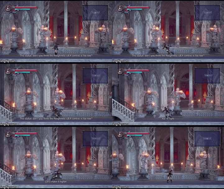
 This stuff just looks A+. Okay I'm done with the praise. If anything I've been kinda negative a lot lately so i was due to do a full reversal. actually, this gif illustrates my point very well, if you look away and then look back while shes moving in front of the house, you might miss the scarf and her mist trail because theyre close enough in color to the background that they blend in despite being moving things however, the good thing about her cel shaded design is contrasting colors that pop, in those cases instead of your eye being drawn to her dress and trails, your eyes are drawn to her legs (in lighter colored areas itd be her dark dress, blue panel, and trails thatd stand out more), which stand out really well against that background even with the small size of that gif, thats something you couldnt easily accomplish if her design was made of more realistic colors or you crammed a ton of shades into her to make her fit the very detailed backgrounds also, think of this, what if theres an option to recolor her dress ingame? the more detail/shades that get colored the more chance you run of less colors looking good (im looking at you mmos and blue, especially 'blue' lipsticks thatre ugly ass gray >.<) |
|
Pure Miriam
Legendary Comrade
Shardbinder
 [TI1] "A new, vital heart, pulsing with the old blood." -IGA
Posts: 1,068

inherit
Legendary Comrade
445
0
Oct 20, 2019 3:32:00 GMT -6
1,600
Pure Miriam
[TI1] "A new, vital heart, pulsing with the old blood." -IGA
1,068
Jul 25, 2015 2:19:20 GMT -6
July 2015
puremiriam
|
Post by Pure Miriam on Jan 6, 2017 1:52:46 GMT -6
Eeeh.... I really didn't expect such criticism over stunning visuals. I'm going to play advocate here and try to defend the whole thing, because i really think some people are exaggerating. This will be a really long post. Miriam's visuals
Jango You said Miriam looks too "cute". I think that's a really personal opinion and there is no way to counter that, since it is mostly something based on tastes. I completely understand what you are talking about, although i don't agree. That reminds me of the criticism over the art shift between the GBA Castlevanias and the DS Castlevanias years ago. Many people said it looked too "cute and animesque" and didn't fit Castlevania at all. But i don't agree with you that Miriam's overall design look too "cute". She actually looks almost exactly like the official artwork. And for me, her official artwork looks badass and awesome and not "cute / moe" like as you are implying. But, as i said, that is really a personal opinion, there isn't much i can say about it and i respect yours. But yeah, they will not change that now. Shaders
Scars Unseen I partially agree with what you said. The shaders we choose a year ago made Miriam look way different from the rest of the scenario. But that was our choose, the backer's choice. The demo, and the videos showing gameplay and the Village now are all using the exact same shader choices we made back in the day. She doesn't look "floaty" now. She always looked that, since the beginning. Maybe it is a little more evident now due to the lightning work, but the game had that look since the beginning. And, to be really fair, most 2d games have the main character looks and feels "floaty" in a way. I don't know, for me, that was always the case in all Castlevanias i ever played (and i played all of them). I DO AGREE she looks a little "more" off than in the other scenarios and i pointed out that it doesn't happen in all places, just in the brighter ones. As i said before, this is the same criticism over the Vepar Boss color. It looked off with the rest of the scenario. I'm sticking with my opinion. The problem is that brighter places will make Miriam stand out, while in more darker ones she blends way better. I really don't see that as a huge problem. It is a little off, yes, i do agree. But it is not something that destroys the whole game's look. (I know, you didn't said that). Flatness and cardoboard look
Thomas Happ's opinionI partially agree with what Thomas Happ has said. The "flatness of the buildings" is there, yes, but i don't see any "cardboard" look. To be fair, the Village has a very 2d feel and maybe that's the problem. I don't know, it seems some people here aren't used to 2.5d games. Floaty, flatness, cardboard look...All those things are in most 2.5d games. And all those things are in Bloodstained since the first screenshot of the Demo. It surprises me people are noticing those things just now. Seeing where the character is
Astaroth I completely agree with you. A rule of thumb in video game design is that you should never lose track of where the player's character is. People said we couldn't tell what was plataform and what wasn't in the ship, so they fixed that. Totally agree with you. Defending Visuals
CastleDan You are not the odd one. Although i do think sometimes she seems a little off, i have almost no complaints as the game's look right now. Don't mind the Neogaf opinion. Most haters in the internet doesn't do anything else tham complain. People here are being constructive, people there are just being hater. Some Gifs
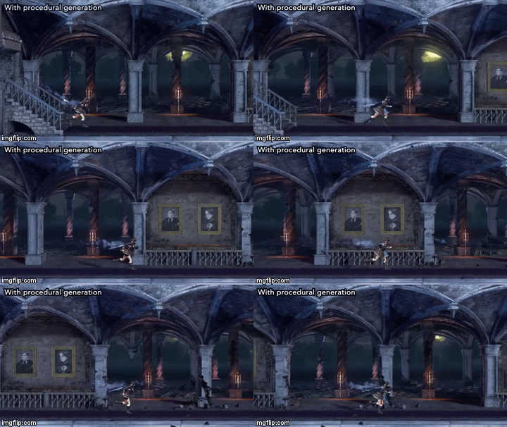
I'm not saying things are perfect. Yes, she looks a little off sometimes and yes, she was running while the celling was crumbling. But i think most people are exaggerating and seeing way more things than are actually there. Take a look at the gifs below: The Demo (without enemies) The Castle Entrance (Area with Statues) 
The Castle Entrance (corridor)

The Village
I honestly fail to see the huge difference between those areas, aestethically wise. Miriam looks a little floaty in all of them. She looks a little off in all of them. The only real difference is that in the Village, the cellings are brighter, so, you can see that a little more than in all other enviroments so far.
And yes, the twitter picture  How absurdly stunning is this red hellish looking village! |
|
Elfina Ashfield
The Surreal Stargazer
Ancient Legion  [TI0]Unarchived Nova
Posts: 336

inherit
The Surreal Stargazer
209
0
Jul 13, 2019 12:31:29 GMT -6
319
Elfina Ashfield
[TI0]Unarchived Nova
336
Jun 29, 2015 4:14:08 GMT -6
June 2015
elmirador
|
Post by Elfina Ashfield on Jan 6, 2017 2:06:49 GMT -6
Great post dan!
After comparing the first two picture I can grasp some sense of blending red and blue together, but my complaint holds: the red part is over-saturated and maybe too warm for this setting, made the red color more "purple-ish" or dim the red light a little bit might help that a lot, and also the scene looked way better in motion than static picture.
BTW the third picture from the project's earlier days seems like a toy house compared with the first two lol
------
the Twitter picture:
Not being offensive but the ground and the road sign seems somehow cheap to me, background objects are amazing though.
Well this picture might be put together within a short amount of time so I guess I have no complaint about it.
|
|
inherit
572
0
Jun 19, 2019 3:23:00 GMT -6
16
lordmaximos
15
Aug 17, 2015 8:04:38 GMT -6
August 2015
lordmaximos
|
Post by lordmaximos on Jan 6, 2017 2:27:46 GMT -6
Yea I have to agree, they can make the background so detailed but character and enemies cel shaded, I hope they would cel shade everything as they showed on the shading thread, that way this game will look absolutely gorgeous and unique, specially for a horror atmosphere! I hope,they do that, and I am kinda sure that cel shading will help with the lighting too!
|
|
Ryngar Acia
Loyal Familiar
 [TI2] ...and Another..
Posts: 291
inherit
736
0
Feb 2, 2023 14:02:51 GMT -6
444
Ryngar Acia
[TI2] ...and Another..
291
Sept 5, 2015 11:36:53 GMT -6
September 2015
ryngaracia
|
Post by Ryngar Acia on Jan 6, 2017 3:28:40 GMT -6
Looks pretty nice. I'm sure they'll touch up the background and make it look even better. :)
|
|
LeoLeWolferoux
Wielder of Emptiness
Fifty Storms  [TI0] ...an intellectual with no room for feelings...
Posts: 673

inherit
Wielder of Emptiness
1573
0
Jun 8, 2024 22:55:53 GMT -6
438
LeoLeWolferoux
[TI0] ...an intellectual with no room for feelings...
673
Jun 25, 2016 1:34:49 GMT -6
June 2016
leolewolferoux
|
Post by LeoLeWolferoux on Jan 6, 2017 3:57:20 GMT -6
Once again, the update happened when I was fucking at work. B-/ All together I'm glad to see more of what the Bloodstained team have to offer. The village looks absolutely beautiful, as pure said, and I think it's just really coming together well. And yes, Enkeria , the walking animation while falling did throw me off a bit ahahaha.  |
|
Kale
New Blood

Posts: 83
inherit
1687
0
May 15, 2017 13:22:25 GMT -6
43
Kale
83
Jul 30, 2016 0:01:31 GMT -6
July 2016
kale
|
Post by Kale on Jan 6, 2017 5:14:27 GMT -6
I don't think being floaty was part of what made the game great, but rather it was great despite of it.
|
|
Enkeria
Silver in the Dark
Fifty Storms  Amzeer - Aurora of Rebirth
Posts: 1,908

inherit
Silver in the Dark
1757
0
Oct 27, 2024 12:45:42 GMT -6
1,287
Enkeria
Amzeer - Aurora of Rebirth
1,908
Nov 28, 2016 17:56:45 GMT -6
November 2016
enkeria
|
Post by Enkeria on Jan 6, 2017 5:56:44 GMT -6
"Miriam seems out of place" One or a combination out of these have been requested:
- Cell shading to the environment to make her pop less. Perhaps where she can interact, have it fade to the background.
- Change the environmental colors to darker.
- Change the environmental blue into more red colors on THIS area.
- Change nothing about the colors, instead add fire and glowing coal on these red areas.
- Platforms performance and viewpoint could be changed or shifted.
- Add cell shade on platforms, but not the background.
- Make all platforms toned down, but have them pop with thick shadows or outlines.
- Give her a strong shadow so minimize the feel of her "floating".
- Ground could much more darker when it comes to the below / underground objects.
- It is fine as is, just need more objects and enemies.
- Have her glow, making her outline being part of something else than just a cell shade / "line".
- Change Miriam (and all monster / item assets) to a more real style.
- Leave as is. Its fine.
More?
|
|
Enkeria
Silver in the Dark
Fifty Storms  Amzeer - Aurora of Rebirth
Posts: 1,908

inherit
Silver in the Dark
1757
0
Oct 27, 2024 12:45:42 GMT -6
1,287
Enkeria
Amzeer - Aurora of Rebirth
1,908
Nov 28, 2016 17:56:45 GMT -6
November 2016
enkeria
|
Post by Enkeria on Jan 6, 2017 6:29:02 GMT -6
I added external links to the first post in this thread. Just so you guys can have a look on additional comments elsewhere.
|
|
Kale
New Blood

Posts: 83
inherit
1687
0
May 15, 2017 13:22:25 GMT -6
43
Kale
83
Jul 30, 2016 0:01:31 GMT -6
July 2016
kale
|
Post by Kale on Jan 6, 2017 6:55:54 GMT -6
Well, my suggestion is sort of making the platform not look like it's been illuminated by a differnt lighting, because that's what it seems like to me.
|
|
inherit
7
0
Jun 28, 2019 21:35:13 GMT -6
1,291
CastleDan
1,514
May 28, 2015 9:50:13 GMT -6
May 2015
castledan
|
Post by CastleDan on Jan 6, 2017 9:06:26 GMT -6
I don't think being floaty was part of what made the game great, but rather it was great despite of it. Huh? The feel of how Alucard controls was most definitely a high point of the game, especially at that time. The criticisms always fell on balancing more than anything. |
|
Redogan
Monster-Hunting Igavaniac
Fifty Storms  [TI0] Game On!
Posts: 402

inherit
Monster-Hunting Igavaniac
477
0
Nov 22, 2024 9:53:11 GMT -6
373
Redogan
[TI0] Game On!
402
Jul 31, 2015 16:51:36 GMT -6
July 2015
redogan
|
Post by Redogan on Jan 6, 2017 9:42:47 GMT -6
Regarding the lighting on the platforms and the red tint on everything in the village:
The lighting seems right to me due to it being a twilight/dusk time setting. I imagine the sun going down on the side where the players are and shining that last bit of light on the village buildings, giving it that red look. The platforms (probably made of a different material that shines brighter--almost like a ceramic yellow shingle) are tilted toward the light at just the right angle so they have a different hue.
I think the lighting in the village is OK. It gives off an ominous tone that is perfect for the beginning of an adventure.
|
|
inherit
7
0
Jun 28, 2019 21:35:13 GMT -6
1,291
CastleDan
1,514
May 28, 2015 9:50:13 GMT -6
May 2015
castledan
|
Post by CastleDan on Jan 6, 2017 10:15:03 GMT -6
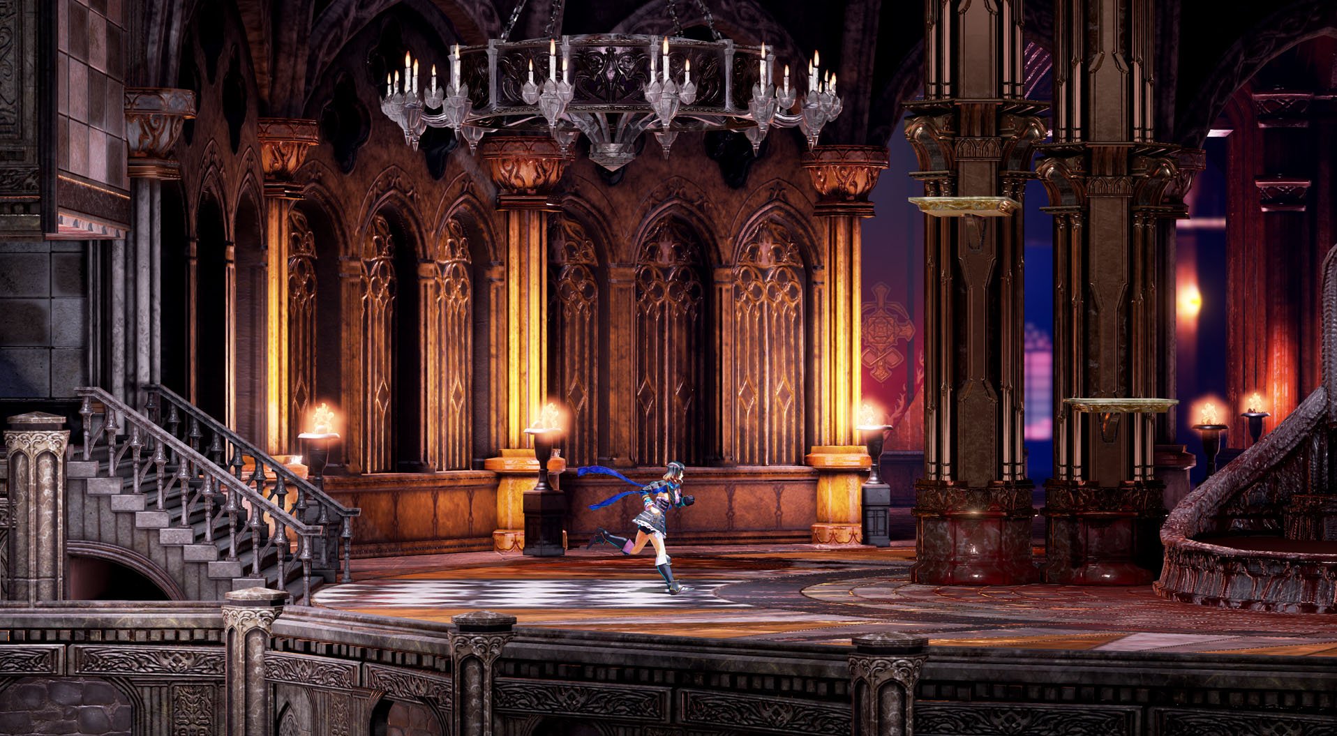
Does anyone like how the castle entrance used to look more? With color? I did, it's not something I care for them to change or make them do extra work on...just curious if anyone else agrees?  vs  |
|
Astaroth
Fifty Storms  What a wonderful night to have a curse...
Posts: 1,213

inherit
57
0
Jan 4, 2022 11:47:39 GMT -6
1,368
Astaroth
What a wonderful night to have a curse...
1,213
Jun 10, 2015 20:22:05 GMT -6
June 2015
astaroth
|
Post by Astaroth on Jan 6, 2017 10:32:40 GMT -6
color may come back in later, we dont know exactly how done that 2nd shot is, they may have a default marble texture to check lighting and shader for depth and detail, plus if thats the entrance hall i could see the castle having this cold, dead first couple rooms that leads to a more colorful set of rooms like the 1st pic to further wow the player
in either case we have 1600+ rooms to explore, i can see some being very visually stunning but very selective with color to draw the eye like the red and gold tapestries framing those blood red windows in the very back, iga and team have plenty of room to put in color >P
|
|
BalancedHydra
Pillow Weapon Advocate
Master Alchemist
 [TI1]
[TI1]
Posts: 572

inherit
Pillow Weapon Advocate
848
0
Jul 20, 2021 8:20:41 GMT -6
622
BalancedHydra
[TI1]
572
Oct 26, 2015 18:21:13 GMT -6
October 2015
balancedhydra
|
Post by BalancedHydra on Jan 6, 2017 10:35:12 GMT -6
I do have one question. What do the visually impaired have to say about this update or the game in general? We gotta watch out for the minorities.
|
|
XombieMike
Administrator
Fifty Storms 
Posts: 4,009

inherit
Administrator
236
0
1
Nov 22, 2024 8:42:49 GMT -6
4,236
XombieMike
4,009
Jul 8, 2015 7:10:22 GMT -6
July 2015
xombiemike
|
Post by XombieMike on Jan 6, 2017 10:42:53 GMT -6
CastleDan I'd very much like to see gameplay look that rich.
|
|
inherit
7
0
Jun 28, 2019 21:35:13 GMT -6
1,291
CastleDan
1,514
May 28, 2015 9:50:13 GMT -6
May 2015
castledan
|
Post by CastleDan on Jan 6, 2017 12:27:47 GMT -6
A question I'm pretty curious about. Considering there's already two areas now that are outside the actual castle does this mean the 'ACTUAL' castle won't in fact be the biggest yet? Basically is the 1360 number the castle or the castle with the boat and the village.
|
|
Enkeria
Silver in the Dark
Fifty Storms  Amzeer - Aurora of Rebirth
Posts: 1,908

inherit
Silver in the Dark
1757
0
Oct 27, 2024 12:45:42 GMT -6
1,287
Enkeria
Amzeer - Aurora of Rebirth
1,908
Nov 28, 2016 17:56:45 GMT -6
November 2016
enkeria
|
Post by Enkeria on Jan 6, 2017 12:43:14 GMT -6
A question I'm pretty curious about. Considering there's already two areas now that are outside the actual castle does this mean the 'ACTUAL' castle won't in fact be the biggest yet? Basically is the 1360 number the castle or the castle with the boat and the village. That's a question of interpretation I hope these areas are NOT about the Castle being the biggest one yet. These are treated as a prelude of some kind, the stage of which the story arc is built upon, the quest and the idea of why Miriam will do whatever she will do. The castle, having more rooms than ever before should be the biggest castle as of yet. While Symphony of the Night had two castles (in one), there could be some kind of argue that the village and the ship are also part of the "biggest castle". If the village also are something we need to frequently visit (using good old library village card) then I guess the village and the ship will be part of the whole "biggest castle". I hope not, mostly because I am greedy, and more locations are fun, if treated right and filled with something to do more than a long corridor of... jog and.. nothing..ness.. Realistically, the "caramel maps" that are made, are all done with the same engine, controlling same set of rules. If I were a developer, I would count every piece of scenery into the total sum, which would in a sense mean that everything, even empty locations (and top areas that might never been available for us to visit) a part of that sum, which would be deemed as "the biggest castle yet". This is perhaps a good question for Mr. IGA in his next youtube video!? Sorry for my odd writing abilities, I usually think backwards and my skills in writing in English are narrow. I hope people understand it anyhow. |
|
Jango
New Blood

Posts: 72
inherit
509
0
Oct 19, 2018 19:35:22 GMT -6
104
Jango
72
Aug 4, 2015 13:00:30 GMT -6
August 2015
jango
|
Post by Jango on Jan 6, 2017 13:00:05 GMT -6
I kept thinking that the character of BS's environments and decay felt a bit familiar. Then it occurred to me that the sort of rough and scratchy feel of the world isnt entirely dissimilar to the splotchy roughness found in these old gems:   Maybe Im seeing things but maybe not. To me, this has always been the goalpost look of CV but pixel art has its limitations. But now with the resolution and polycounts available it could be possible to realize this art more closely in in-game assets. A guy can dream I guess. |
|
inherit
7
0
Jun 28, 2019 21:35:13 GMT -6
1,291
CastleDan
1,514
May 28, 2015 9:50:13 GMT -6
May 2015
castledan
|
Post by CastleDan on Jan 6, 2017 13:18:13 GMT -6
A question I'm pretty curious about. Considering there's already two areas now that are outside the actual castle does this mean the 'ACTUAL' castle won't in fact be the biggest yet? Basically is the 1360 number the castle or the castle with the boat and the village. That's a question of interpretation I hope these areas are NOT about the Castle being the biggest one yet. These are treated as a prelude of some kind, the stage of which the story arc is built upon, the quest and the idea of why Miriam will do whatever she will do. The castle, having more rooms than ever before should be the biggest castle as of yet. While Symphony of the Night had two castles (in one), there could be some kind of argue that the village and the ship are also part of the "biggest castle". If the village also are something we need to frequently visit (using good old library village card) then I guess the village and the ship will be part of the whole "biggest castle". I hope not, mostly because I am greedy, and more locations are fun, if treated right and filled with something to do more than a long corridor of... jog and.. nothing..ness.. Realistically, the "caramel maps" that are made, are all done with the same engine, controlling same set of rules. If I were a developer, I would count every piece of scenery into the total sum, which would in a sense mean that everything, even empty locations (and top areas that might never been available for us to visit) a part of that sum, which would be deemed as "the biggest castle yet". This is perhaps a good question for Mr. IGA in his next youtube video!? Sorry for my odd writing abilities, I usually think backwards and my skills in writing in English are narrow. I hope people understand it anyhow. It's not even about being greedy. It's about saying biggest castle and meaning biggest castle. Again, I'm not implying they went against their word because we don't really know without clarification but they're two different things certainly. |
|