Busterific
Hairy Old Man
Loyal Familiar

Posts: 249

inherit
Hairy Old Man
1697
0
Mar 30, 2022 13:03:31 GMT -6
222
Busterific
249
Aug 19, 2016 16:36:35 GMT -6
August 2016
busterific
|
Post by Busterific on Nov 2, 2017 13:05:28 GMT -6
I wonder if the color of the mana bar will change during the game to give an indication of how the curse is affecting Miriam. For example when it's blue Miriam is resisting the curse, while when it changes to purple or another color she's being overtaken by the curse.
|
|
JeffCross
Shadow of the Night
Ancient Legion  [TI0] Die monster!!!!!!
Posts: 1,365

inherit
Shadow of the Night
46
0
Aug 2, 2019 16:52:01 GMT -6
711
JeffCross
[TI0] Die monster!!!!!!
1,365
Jun 9, 2015 16:58:57 GMT -6
June 2015
jeffcross773
|
Post by JeffCross on Nov 2, 2017 13:25:23 GMT -6
Just wondering if there will be an option to make headgear invisible... Yeah not really what I meant... I already know you can change the looks of Miriam if she takes off certain pieces of armor... What I wanted was the stats of the headgear without the looks of the headgear... OH! wouldn't it be cool if you can choose how your headgear, or any gear that changes Miram's look, can change by just assigning it adding a piece of armor to a "glamor" slot? lol if they haven't done this yet I doubt they will add it though... but it was just a random thought... |
|
neff
Loyal Familiar

Posts: 239
inherit
1002
0
Apr 12, 2020 8:51:20 GMT -6
163
neff
239
Jan 3, 2016 19:14:43 GMT -6
January 2016
neff
|
Post by neff on Nov 2, 2017 13:28:31 GMT -6
In this latest showcase, you can see her standard headgear finally being in the inventory. This means, you should be able to pick "nothing" and end up with only hair. Something that we could not in E3 Demo 2016, but maybe E3 demo 2017?! Yeah not really what I meant... I already know you can change the looks of Miriam if she takes off certain pieces of armor... What I wanted was the stats of the headgear without the looks of the headgear... OH! wouldn't it be cool if you can choose how your headgear, or any gear that changes Miram's look, can change by just assigning it adding a piece of armor to a "glamor" slot? lol if they haven't done this yet I doubt they will add it though... but it was just a random thought... interesting, I kinda wonder about that too, we haven' seen the customize option just yet, and what with the various accessorizing, lumping it with the same slots as equipment wouldn't be how id do it. |
|
JeffCross
Shadow of the Night
Ancient Legion  [TI0] Die monster!!!!!!
Posts: 1,365

inherit
Shadow of the Night
46
0
Aug 2, 2019 16:52:01 GMT -6
711
JeffCross
[TI0] Die monster!!!!!!
1,365
Jun 9, 2015 16:58:57 GMT -6
June 2015
jeffcross773
|
Post by JeffCross on Nov 2, 2017 13:37:04 GMT -6
Yeah not really what I meant... I already know you can change the looks of Miriam if she takes off certain pieces of armor... What I wanted was the stats of the headgear without the looks of the headgear... OH! wouldn't it be cool if you can choose how your headgear, or any gear that changes Miram's look, can change by just assigning it adding a piece of armor to a "glamor" slot? lol if they haven't done this yet I doubt they will add it though... but it was just a random thought... interesting, I kinda wonder about that too, we haven' seen the customize option just yet, and what with the various accessorizing, lumping it with the same slots as equipment wouldn't be how id do it. I personally think the customization will be a completely different system (this is based on assumptions so take it for what it is... a guess). but that is an interesting way to do it, going through the equipment slots... hmmmm... yes interesting...  |
|
Galamoth
Ancient Legion
Eternal Guardian
 [TI2] Boss of the Floating Catacombs. Hopes nobody finds his hidden Beryl Circlet.
Posts: 3,402

inherit
Ancient Legion
195
0
Aug 19, 2023 8:35:43 GMT -6
2,620
Galamoth
[TI2] Boss of the Floating Catacombs. Hopes nobody finds his hidden Beryl Circlet.
3,402
Jun 24, 2015 13:36:33 GMT -6
June 2015
galamoth
|
Post by Galamoth on Nov 2, 2017 14:12:45 GMT -6
... Speaking of Zangetsu, the phrase he speaks during his dodging move is also quite similar to Julius Belmont's. As any of us who've played the Sorrow games may have already figured out by now, Omnia Vanitas is Latin for "All Is Vanity". ^ Zangetsu says "Ku-Soku-Ze-Shiki", which I believe literally means "all is vanity". It's one-half of a Zen Buddhist chant. Mana may correct me on this if I'm wrong, since I'm not actually fluent in Japanese. The only reason I know this at all is due to one friend of mine being a Buddhist (there's even a small Buddhist temple just a few blocks from my house in Maryland), AND because I often played as Yoshimitsu in the Soul Calibur games back then (before I ever played the Sorrow duology of Castlevania games). The character tends to say "Shiki-Soku-Ze-Ku" ("matter is void") after winning. Wow, you and theplottwist are really sharp! He noticed this too and expanded upon similarities between Zangetsu and Julius in Discord. I hope he posts that here too. Ooh, someone else noticed this? Excellent! |
|
purifyweirdshard
Administrator
Administrator  Calling from Heaven
Posts: 3,789
Staff Mini-Profile Theme: Example 2

inherit
Administrator
210
0
1
Nov 22, 2024 16:16:48 GMT -6
3,660
purifyweirdshard
Calling from Heaven
3,789
Jun 29, 2015 7:24:38 GMT -6
June 2015
purifyweirdsoul
Staff Mini-Profile Theme: Example 2
|
Post by purifyweirdshard on Nov 2, 2017 14:41:42 GMT -6
And you know, probably just the Julius and/or Buddhism reference, but there's another possible connection. In the Old Testament book of Ecclesiastes, Solomon's book of reflection, he goes on at length about how all is vanity. www.biblegateway.com/passage/?search=Ecclesiastes+1&version=ESVOne and the same with the Lesser Key of Solomon figure. In short, he found existence a vain and tiresome affair, having gained all manner of worldly wealth and wisdom, finding it meaningless. |
|
Galamoth
Ancient Legion
Eternal Guardian
 [TI2] Boss of the Floating Catacombs. Hopes nobody finds his hidden Beryl Circlet.
Posts: 3,402

inherit
Ancient Legion
195
0
Aug 19, 2023 8:35:43 GMT -6
2,620
Galamoth
[TI2] Boss of the Floating Catacombs. Hopes nobody finds his hidden Beryl Circlet.
3,402
Jun 24, 2015 13:36:33 GMT -6
June 2015
galamoth
|
Post by Galamoth on Nov 2, 2017 15:41:16 GMT -6
And you know, probably just the Julius and/or Buddhism reference, but there's another possible connection. In the Old Testament book of Ecclesiastes, Solomon's book of reflection, he goes on at length about how all is vanity. www.biblegateway.com/passage/?search=Ecclesiastes+1&version=ESVOne and the same with the Lesser Key of Solomon figure. In short, he found existence a vain and tiresome affair, having gained all manner of worldly wealth and wisdom, finding it meaningless. So one must literally convince themselves that life is meaningless for a brief time in order to use an advanced dodging move of intangibility.   Doesn't quite fit Zangetsu's obsession with vengeance against demons & alchemists. |
|
purifyweirdshard
Administrator
Administrator  Calling from Heaven
Posts: 3,789
Staff Mini-Profile Theme: Example 2

inherit
Administrator
210
0
1
Nov 22, 2024 16:16:48 GMT -6
3,660
purifyweirdshard
Calling from Heaven
3,789
Jun 29, 2015 7:24:38 GMT -6
June 2015
purifyweirdsoul
Staff Mini-Profile Theme: Example 2
|
Post by purifyweirdshard on Nov 2, 2017 15:47:10 GMT -6
There is a precedent, Kenshiro and Raoh can do basically exactly that with musō tensei, 無想転生.
|
|
Yän
Herald of the Moon
Loyal Familiar

Posts: 476

inherit
Herald of the Moon
1316
0
Jan 2, 2022 8:01:36 GMT -6
415
Yän
476
Jun 12, 2016 6:59:44 GMT -6
June 2016
yaen
|
Post by Yän on Nov 2, 2017 16:35:02 GMT -6
Colours too faded? This might interest youSince some people including me have had some issues with the colours or lack thereof in the garden section that was shown, I decided to take a screenshot and do a quick mockup of how some different / brighter colours could bring the scene to life. I might have gone a little overboard to illustrate the weight of the effect but I actually kind of like the lush look of the vegetation in the edit... What do you guys think?  
|
|
neff
Loyal Familiar

Posts: 239
inherit
1002
0
Apr 12, 2020 8:51:20 GMT -6
163
neff
239
Jan 3, 2016 19:14:43 GMT -6
January 2016
neff
|
Post by neff on Nov 2, 2017 16:55:44 GMT -6
Colours too faded? This might interest youSince some people including me have had some issues with the colours or lack thereof in the garden section that was shown, I decided to take a screenshot and do a quick mockup of how some different / brighter colours could bring the scene to life. I might have gone a little overboard to illustrate the weight of the effect but I actually kind of like the lush look of the vegetation in the edit... What do you guys think? I'm kinda wondering if the color discussions we are having now might have something to do with the shaders that we voted for earlier.... I knew I picked the right one... |
|
Yän
Herald of the Moon
Loyal Familiar

Posts: 476

inherit
Herald of the Moon
1316
0
Jan 2, 2022 8:01:36 GMT -6
415
Yän
476
Jun 12, 2016 6:59:44 GMT -6
June 2016
yaen
|
Post by Yän on Nov 2, 2017 17:03:26 GMT -6
Colours too faded? This might interest youSince some people including me have had some issues with the colours or lack thereof in the garden section that was shown, I decided to take a screenshot and do a quick mockup of how some different / brighter colours could bring the scene to life. I might have gone a little overboard to illustrate the weight of the effect but I actually kind of like the lush look of the vegetation in the edit... What do you guys think? I'm kinda wondering if the color discussions we are having now might have something to do with the shaders that we voted for earlier.... I knew I picked the right one... I doubt that. UE4's material editor is definitely flexible enough to add more saturation to just about any colour. But even if the materials are somehow too limited, the changes I made could easily be done with some colour grading post-fx. It's more of an artistic decision rather than a technical one. |
|
inherit
1964
0
Jun 19, 2019 13:50:50 GMT -6
13
krystal
23
Aug 30, 2017 13:14:15 GMT -6
August 2017
krystal
|
Post by krystal on Nov 2, 2017 17:17:15 GMT -6
the colors look fine and not faded. enhancing the colors would just make it too cartoony and contrived coloring. the portable IGAvania games were too colorful, they were only fitting for those games because they weren't aiming for more natural and realistic art direction .
sure, Bloodstained leans towards anime, but its nice how things look dark, and faded colors can make the locations more natural than vibrant colors that just totally betray natural lighting fundamentals.
if you want it to be more vibrant colorful, just mess with your TV's tint, color stuff, brightness, contrast, etc.
for this particular game, Bloodstained's colors are perfect , mess with the coloring or lighting too much and it could harm the backgrounds and/or character models.
the color debate reminds me of the debates between Diablo and Diablo III fans. Order of Ecclesia's coloring is more like Diablo III's, while Bloodstained's is more like Diablo I and II, which is ok and results in a more mature and breathtaking dark world full of life
|
|
inherit
7
0
Jun 28, 2019 21:35:13 GMT -6
1,291
CastleDan
1,514
May 28, 2015 9:50:13 GMT -6
May 2015
castledan
|
Post by CastleDan on Nov 2, 2017 17:42:40 GMT -6
the colors look fine and not faded. enhancing the colors would just make it too cartoony and contrived coloring. the portable IGAvania games were too colorful, they were only fitting for those games because they weren't aiming for more natural and realistic art direction . sure, Bloodstained leans towards anime, but its nice how things look dark, and faded colors can make the locations more natural than vibrant colors that just totally betray natural lighting fundamentals. if you want it to be more vibrant colorful, just mess with your TV's tint, color stuff, brightness, contrast, etc. for this particular game, Bloodstained's colors are perfect , mess with the coloring or lighting too much and it could harm the backgrounds and/or character models. the color debate reminds me of the debates between Diablo and Diablo III fans. Order of Ecclesia's coloring is more like Diablo III's, while Bloodstained's is more like Diablo I and II, which is ok and results in a more mature and breathtaking dark world full of life I don't think it'd make it cartoony at all to increase some of the color so it's not just a bunch of grey's and browns: Let me just give an example :   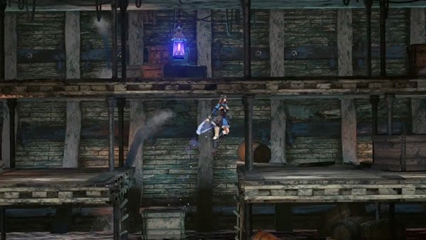  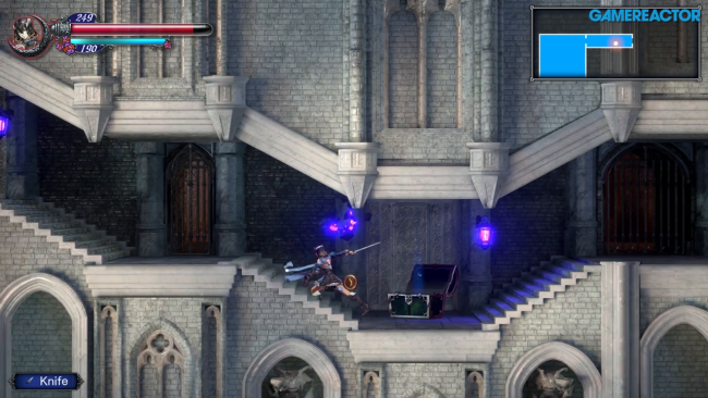   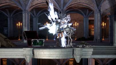 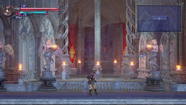 Compared to some of the more colorful things we've seen : The first pic below is one of the most gorgeous locations BECAUSE of the color in it and that was just a concept vid. I'm not saying it needs to be THAT colorful or that vibrant but it's one thing that first video of the game did better than what i'm seeing now. Things in the background have color.    I don't think anyone wants it cartoony but I think not many people want a drab colorless world either, I don't find it all that appealing to travel one of the biggest castle's ever and see the same shades of grey on everything. There's a balance games can hit, where it's moody and brooding while has color in it's world to suck you in and not feel lifeless. The bottom pic shows how much just a little bit extra color or lighting can do for a location. It didn't turn it into a cartoon it makes it feel alive. Your point is valid that you don't want to go overboard with color because it can throw it off balance and the DS games did go overboard in that regard but let's be real right now...... THEY AREN'T CLOSE TO GOING OVERBOARD WITH COLOR....it could use a bit more.
|
|
Galamoth
Ancient Legion
Eternal Guardian
 [TI2] Boss of the Floating Catacombs. Hopes nobody finds his hidden Beryl Circlet.
Posts: 3,402

inherit
Ancient Legion
195
0
Aug 19, 2023 8:35:43 GMT -6
2,620
Galamoth
[TI2] Boss of the Floating Catacombs. Hopes nobody finds his hidden Beryl Circlet.
3,402
Jun 24, 2015 13:36:33 GMT -6
June 2015
galamoth
|
Post by Galamoth on Nov 2, 2017 19:29:42 GMT -6
Colours too faded? This might interest youSince some people including me have had some issues with the colours or lack thereof in the garden section that was shown, I decided to take a screenshot and do a quick mockup of how some different / brighter colours could bring the scene to life. I might have gone a little overboard to illustrate the weight of the effect but I actually kind of like the lush look of the vegetation in the edit... What do you guys think? I can't help but imagine the Forest Temple from The Legend of Zelda: Ocarina of Time when looking at either image. Either way, I doubt there's going to be the exact same level of color-saturation in every area throughout the entire Castle. I'm not worried at all. |
|
inherit
1574
0
Jul 25, 2019 8:28:19 GMT -6
53
kronfarfar
75
Jun 25, 2016 4:22:43 GMT -6
June 2016
kronfarfar
|
Post by kronfarfar on Nov 3, 2017 0:48:30 GMT -6
I also agree that we need more color in the environments.
As of right now "Garden of Silence" just seem bland.
Just like in Yäns example you can see that it's quite an easy fix.
Even though they couldn't give out more information about a new demo in this update I am very happy that they atleast adressed it!
|
|
Pure Miriam
Legendary Comrade
Shardbinder
 [TI1] "A new, vital heart, pulsing with the old blood." -IGA
Posts: 1,068

inherit
Legendary Comrade
445
0
Oct 20, 2019 3:32:00 GMT -6
1,600
Pure Miriam
[TI1] "A new, vital heart, pulsing with the old blood." -IGA
1,068
Jul 25, 2015 2:19:20 GMT -6
July 2015
puremiriam
|
Post by Pure Miriam on Nov 3, 2017 0:59:32 GMT -6
The discussion about color reminds me of somethings. Let me separate this in topics:
REAL IS BROWN
There is a discussion, that is even at the TV Tropes site, called "Real is Brown". When you want to make something look realistic in a game, you normally heavily tint a game with a single color for the sake of realism, using such things as sepia effects. This was really common in the past, to hide color and graphical limitations of games, but even nowadays, this is used because it is easier to give the impression of realism, if most things have a tint of brown or gray. Dragon Age, Mass Effect, the newest Resident Evil Games, Tomb Raider, among many others, all have that problem with varying degrees. It's a real problem that many points out and you have games that totally averts this, sometimes with beautiful or weird effects, such as Mirror's Edge, some Final Fantasies and such. So, i believe the "Real is Brown" problem is what we are discussing here. In order to make things look realistic in a 3d environment, the whole game has a tint of gray / brown and that sacrifices a more colorful look. But that is not in full effect at some of the game's areas. EDIT: VEPAR WAS COLORUFL AND PEOPLE WERE NOT PLEASED
 I forgot to add this. My brother reminded me that Vepar was bright and colorful and many people dislike it, to the point where the Dev team had to change it's color pallete. So, yes, expect "Real is Brown" (or Real is Dark Green or Gray) to be in full effect now when the new Vepar's colors are added to the game. THE VILLAGE WAS COLORFUL AND PEOPLE WERE NOT PLEASED
Do you guys remember when the village showed up? People criticized it's heavy redish look, and the fact that Miriam didn't blend well with the environment, as if she was floating. This was a heavy criticism at the time, and was the first time Bloodstained was really criticized in a update. The game already have the "Real is Brown" problem but even so, the village had bright red, dark green and strong colors. People were not pleased. Heavily criticism over Miriam floating at the scenario and the village just looked plain "ugly".   They fixed it. Among other things, by giving a brown tint all over it and lowering the color saturation.  SOME AREAS FROM BLOODSTAINED ARE COLORFUL SOME AREAS FROM BLOODSTAINED ARE COLORFUL
Now, take a look at some pictures from bloodstained that were first revealed by IGN. You can still argue that they still have the "Real is Brown" problem, but they look way more bright and colorful than some other areas.   You can also see that in the trailer. Again, "Real is Brown" is in full effect here, but even so, it looks colorful thanks to the details at the background.  THIS IS NOT A WIDESPREAD PROBLEM IN THE GAME THIS IS NOT A WIDESPREAD PROBLEM IN THE GAME
That is my conclusion. By looking at some pictures, such as the ones i showed up there, it seems that the game is using the famous "Real is Brown" trope, where you apply a dark tint (brown, gray), at everything to make it look less cartoony and more realistic. Even so, you can see beautiful scenarios and colors at some areas, that seems to resist the "Real is Brown" effect. I don't really know what to think about this, because for me, the game looks great, but i also agree that, at SOME areas, the "Real is Brown" effect seems a bit lifeless. This is a much more complicated issue to fix than it seems, because many players are used to that by now, since it is so widespread at so many games. Changing now could make the game look too colorful for people that are already used by this. |
|
inherit
7
0
Jun 28, 2019 21:35:13 GMT -6
1,291
CastleDan
1,514
May 28, 2015 9:50:13 GMT -6
May 2015
castledan
|
Post by CastleDan on Nov 3, 2017 8:13:19 GMT -6
The discussion about color reminds me of somethings. Let me separate this in topics:
REAL IS BROWN
There is a discussion, that is even at the TV Tropes site, called "Real is Brown". When you want to make something look realistic in a game, you normally heavily tint a game with a single color for the sake of realism, using such things as sepia effects. This was really common in the past, to hide color and graphical limitations of games, but even nowadays, this is used because it is easier to give the impression of realism, if most things have a tint of brown or gray. Dragon Age, Mass Effect, the newest Resident Evil Games, Tomb Raider, among many others, all have that problem with varying degrees. It's a real problem that many points out and you have games that totally averts this, sometimes with beautiful or weird effects, such as Mirror's Edge, some Final Fantasies and such. So, i believe the "Real is Brown" problem is what we are discussing here. In order to make things look realistic in a 3d environment, the whole game has a tint of gray / brown and that sacrifices a more colorful look. But that is not in full effect at some of the game's areas. EDIT: VEPAR WAS COLORUFL AND PEOPLE WERE NOT PLEASED
 I forgot to add this. My brother reminded me that Vepar was bright and colorful and many people dislike it, to the point where the Dev team had to change it's color pallete. So, yes, expect "Real is Brown" (or Real is Dark Green or Gray) to be in full effect now when the new Vepar's colors are added to the game. THE VILLAGE WAS COLORFUL AND PEOPLE WERE NOT PLEASED
Do you guys remember when the village showed up? People criticized it's heavy redish look, and the fact that Miriam didn't blend well with the environment, as if she was floating. This was a heavy criticism at the time, and was the first time Bloodstained was really criticized in a update. The game already have the "Real is Brown" problem but even so, the village had bright red, dark green and strong colors. People were not pleased. Heavily criticism over Miriam floating at the scenario and the village just looked plain "ugly".   They fixed it. Among other things, by giving a brown tint all over it and lowering the color saturation.  SOME AREAS FROM BLOODSTAINED ARE COLORFUL SOME AREAS FROM BLOODSTAINED ARE COLORFUL
Now, take a look at some pictures from bloodstained that were first revealed by IGN. You can still argue that they still have the "Real is Brown" problem, but they look way more bright and colorful than some other areas.   You can also see that in the trailer. Again, "Real is Brown" is in full effect here, but even so, it looks colorful thanks to the details at the background.  THIS IS NOT A WIDESPREAD PROBLEM IN THE GAME THIS IS NOT A WIDESPREAD PROBLEM IN THE GAME
That is my conclusion. By looking at some pictures, such as the ones i showed up there, it seems that the game is using the famous "Real is Brown" trope, where you apply a dark tint (brown, gray), at everything to make it look less cartoony and more realistic. Even so, you can see beautiful scenarios and colors at some areas, that seems to resist the "Real is Brown" effect. I don't really know what to think about this, because for me, the game looks great, but i also agree that, at SOME areas, the "Real is Brown" effect seems a bit lifeless. This is a much more complicated issue to fix than it seems, because many players are used to that by now, since it is so widespread at so many games. Changing now could make the game look too colorful for people that are already used by this. Yeah but I thnk you're missing what I'm saying. It's not the brown tint to everything that I'm talking about. It's the lack of objects in the actual background that uses a decent amount of color. I made a really good example of that : 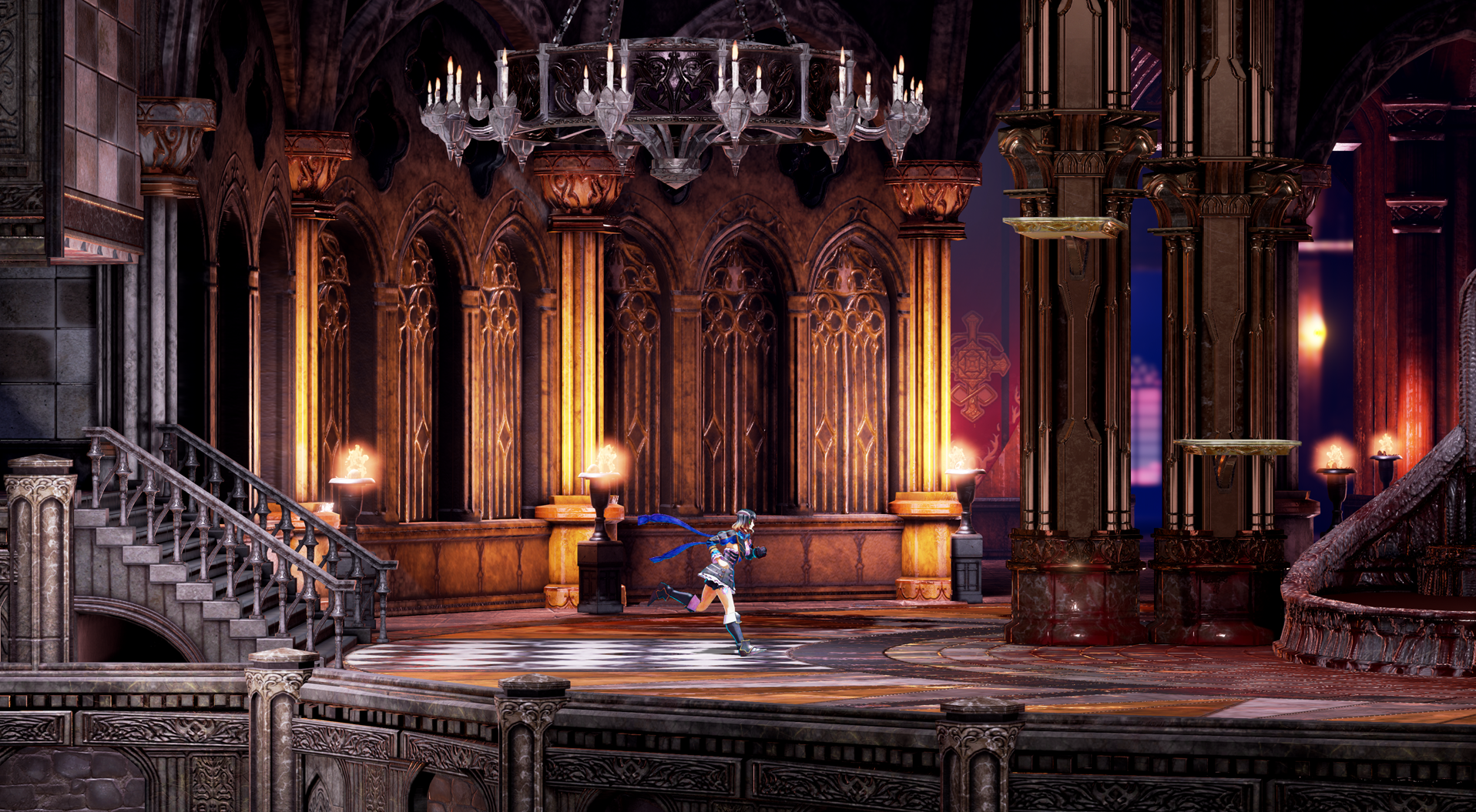 Look at this pic for example - I'll use this as an example. The tile on the floors have black and white, they have a rust color around those tile, there's rich brownish pillars, the walls have a color to them due to the lighting, in the background there's blue and there's big red flags. There's color..... and it was loved when this pic was shown off, it certainly didn't look cartoony. All you have to do is compare the above picture to this one below to see the difference in color ( Anyone else prefer the background in the original pic? It made the castle seem huge compared to the change they made in the recent one below)-  They recently added more color to this area based on a more recent pic of it but that is the kind of thing i'm talking about. Look at the walls, look at the pillars, look at the statues. I see just the flags and the rug has color in the whole environment. It makes the environment look lifeless, when people first saw this area we all loved the look but people complained about the lack of color. So it's not a tint thing, it's objects in the background. You mention the Village was more colorful, it was BRIGHTER sure but it wasn't really more colorful the new picture is just less bright looking it's still very red and has color. It's one of my favorite locations because of it, merely because there's some color difference.  We can assume this is from the same location above so the colors repeat but that's what's a shame because again - Purple rug and what else has color here? Not a tint issue a lack of color.  You said this looks bright, sure....but besides the moon and candles where's the color in the environment?  Where's the color in the background? The garden and the church do the same things..... Is there things with color in them? Sure, but it's very very miminal or way too toned down.  I mean what about this pic really separates itself visually from the above pics? The building itself looks cleaner but it's still has no color to separate itself. All I'm saying is the game could use more color in it's backgrounds. It won't make it cartoony as evident in the first picture of my post, it'll make it have some life.  I get in this room they probably wanted a contrast to the blood but the drapes in the background........nothing is with color outside of the windows and lighting. It just seems pretty widespread. IMO You mention Vepar as proof that people don't want color but it's really not addressing what I'm saying. Vepar had color but Vepar's colors were WAYYYYY too bright, she almost had neon colors which yes it sticks out in a largely colorless environment which is my point right? That the environment itself is drab? So a thing that has neon colors on a largely brown and grey environment will stick out. On top of that, I wasn't talking about enemies I'm talking about the backgrounds.  The Village actually makes my point for me, was it toned down ? Sure, but the environment still had colors in it and that's what I'm asking for. Green trees, red sky, orange/red roof, green ground.... There's color in it, and it's more alive because of it. I never had a problem with the original village but it seems peoples issues stemmed with the lighting being off or something. |
|
purifyweirdshard
Administrator
Administrator  Calling from Heaven
Posts: 3,789
Staff Mini-Profile Theme: Example 2

inherit
Administrator
210
0
1
Nov 22, 2024 16:16:48 GMT -6
3,660
purifyweirdshard
Calling from Heaven
3,789
Jun 29, 2015 7:24:38 GMT -6
June 2015
purifyweirdsoul
Staff Mini-Profile Theme: Example 2
|
Post by purifyweirdshard on Nov 3, 2017 8:26:03 GMT -6
It just so happens that the latest KS comment matches up with what Yän is illustrating: I spoke with my brother about this game this morning and I’d have to agree that he says the “Background” needs a ton of work to bring life to the stages. Now I understand that the game is in the making...but being honest based on what I’ve seen thus far...the background in the stages need more pop more life!!! It just looks clunky and doesn’t have very good details...just plain. We would really like to see more improvement in that area. As far as the time it’s taken to develop this game?!… take as looonnngg as you need because I need this game to hit very high on the charts. I have high hopes and expectations as well...not to sound like a spoiled brat guy lol but......this may be a last swing for games like this if they don’t deliver....I may be right but I hope I’m wrong. Go Iga Go!!!!! As far as Yän's mockup being too bright and cartoony, he realized it was just a bit too much in his post, saying so. He gave it to us anyway to illustrate the point, and I mostly agree. Some more color could really brighten things up there. Miriam looks her best when the area's lighting is brighter, when her model actually looks like it does when it was first shown to us/how it looks in the menu. Darker Miriam just looks like a more plain 3D model. One thing to keep in mind about this environment though I think is that in this case, it's clearly night out with the sky black instead of red. Things won't of course be as colorful outside in the darkness, yet I do agree that it could be adjusted - especially in the case of Miriam imo. I would like her to almost always look brighter so we can see that beautiful shader at work. The main sticking point for this is that the brighter, more saturated look is definitely more game-y, and an aim of IGA's is to make this feel like "a video game", to the point that recently when asked by the Happy Gamer "what do you want players to feel when they play this", he answered (paraphrased from Mana) "I want them to think 'now this is a video game!'". Yeah, and that's what I want.  edit: Can you guys avoid quoting each other and/or posting the same screen shots over and over? haha, PM's post is right above yours CastleDan, no need to quote him. I know you're trying to raise and make your points, but think of the scrolling and the internets. Also, Miriam being darker in Dan's second shot is exactly an example of what I mean where she should be a bit brighter imo. First one is great all around. Also, I don't remember all that much complaining about the village. I do recall the platform complaint about the roofs, but the colors seemed agreeable. |
|
inherit
7
0
Jun 28, 2019 21:35:13 GMT -6
1,291
CastleDan
1,514
May 28, 2015 9:50:13 GMT -6
May 2015
castledan
|
Post by CastleDan on Nov 3, 2017 8:40:27 GMT -6
|
|
inherit
1964
0
Jun 19, 2019 13:50:50 GMT -6
13
krystal
23
Aug 30, 2017 13:14:15 GMT -6
August 2017
krystal
|
Post by krystal on Nov 3, 2017 8:49:44 GMT -6
a videogame is actually lifeless and drab the more colorful it gets, especially for a gothic themed game.
a videogame should take its world seriously and more realistically, regardless of the art direction.
"plain" and "dark" and "real is brown" stuff is a part of the world. censoring that stuff with brighter and more colorful style would just conflict with the essence of its world.
it really should not follow the example of the previous IGAvanias, which were too colorful to begin with.
Bloodstained is looking better with a more mature tone to its colors. it still of course does have vibrant here and there, but not everywhere.
the more colorful it looks the less real the models and world feels.
this isn't some nintendo or sega platformer. and not a Contra either.
so how Bloodstained is looking in the recent gameplay video, the coloring looks fine.
and would say Miriam and the others look better when the shaders stuff isn't so pronounced, and their body blends more with the
dark world, that's better than being pasty shiny anime.
|
|