dareka
Dhampyr
Loyal Familiar

Posts: 345

inherit
Dhampyr
1332
0
Mar 8, 2023 13:21:18 GMT -6
724
dareka
345
Jun 17, 2016 16:09:16 GMT -6
June 2016
dareka
|
Post by dareka on Jun 30, 2018 15:00:47 GMT -6
giwagiwa the thing is, like you mention there's no reason to downgrade unless you want the game to run better on weaker systems, but if that's the case, why wouldn't they downgrade the Galleon as well? It looks like it does in the old screenshots, it's just the castle which looks inferior. Wouldn't a downgrade for weaker systems affect the entire game instead of just parts of it? You have to remember two things: 1) the galleon we saw was a work-in-progress version, so it didn't look as good as the castle in the 2017 version; 2) the geometry and lighting are a lot more simple, and it's a lot darker. I'll have to see high-res screenshots of the galleon, but likely it's just not as graphically demanding as the castle. Then again, it could be that they're just reworking the the castle at this point, so they turned all of those graphical effects I pointed out off in the meantime... again, we need the devs to chime in on this. |
|
dareka
Dhampyr
Loyal Familiar
Posts: 345
inherit
Dhampyr
1332
0
Mar 8, 2023 13:21:18 GMT -6
724
dareka
345
Jun 17, 2016 16:09:16 GMT -6
June 2016
dareka
|
Post by dareka on Jun 30, 2018 14:27:46 GMT -6
Well, I worked on game development daily, so that's how I can disagree. Look, we're obviously not gonna get anywhere here, so let's agree to disagree. You haven't specified what you disagree with, which is a little frustrating. "Hey I disagree with you, but there's no point in me mentioning it in the first place because I'm not going to elaborate any further". You might as well have kept silent. I'm truly sorry if I came off as rude, and I apologize. I just didn't want to side-track the conversation with back and forth on this. So, I'll explain how I disagree. I dunno, maybe you won't even come off as disagreeing per-se; you be the judge. 1. Optimizing geometry is pretty par for the course in 3d game development. No matter how high spec a system you run the game on, you don't want unnecessary geometry that wouldn't be visible to the player. This could also mean swapping out more detailed models when we see characters up close vs during normal gameplay.
Yes, optimizing geometry is common. With modern technology, though, they should be able to manage varying level of detail with tessellation instead of model swapping. The effect should be the same, though: there's no reason for the close-up models on the PC to look like they look now versus how they looked before. These are not polygons you're not going to see, after all - they're close-ups. So the geometry looks a bit over-optimized: a model for a lower-end PC or last gen hardware. So I disagree that his has any bearing on our criticism of the graphics: they're going way below the original minimum hardware requirement for PCs. It's not simple optimization, since they downgraded the close-up models, as well. 2. The only reason to downgrade textures would be to make the game work on lower powered platforms. Texture resolution should stay high, or have the option for different resolutions. So, the idea is you have high-end textures for the more powerful platform, and lower resolution textures of the same image for the lower end platforms. So what you do is you drop the polygon count on the models so that the texture mapping is the same, and so you just need to swap textures. But if they're giving us these textures on the PC version, it begs the question: did they create all of the assets in higher-resolution textures? If so, why aren't they in the demo? The disagreement here, though, ties more in with the next statement... 3. Lighting is more of an artistic choice than performance-heavy in most cases nowadays. Unless you're trying to do something crazy like dynamic shadows for every light source, etc. I see no reason the game can't look like the 2016 screenshot while retaining its current graphical performance.So, I don't see changes in the lighting here being a result of artistic choice - the game's missing post-processing that was there in the 2017 prototype. They can't make it look like that without enabling features that are disabled. Enabling these features will make it drop in performance on lower-end hardware; so, can it meet the graphical performance of the 2016 screenshot? depending on how you implement the lighting, yes, on the recommended hardware specs. It might not look as good in motion, but screenshot level fidelity is possible. What's not possible is having the game run as fast as it will with the current load, which is a lot lighter than anticipated. So what I'm trying to say is that lighting and post-processing effects are GPU intensive. A modern GPU won't struggle with them, that's true; but the game seems have graphics such that even the last generation (in hardware terms) Switch won't struggle, and I doubt you could meet the quality of the 2017 prototype on it, let alone the 2016 screenshot, at least not without some serious (and time-consuming, and therefore costly) trickery. 5. Texture detail/Tessallation/Displacement mapping. This one I'm not too sure of, but look at the bricks that make up the ceiling. Notice how they're much more detailed and kind of "pop-out" in the 2017 version. I think that's just the result of normal maps. Could be. Too small for me to tell, but here I defer to you. |
|
dareka
Dhampyr
Loyal Familiar
Posts: 345
inherit
Dhampyr
1332
0
Mar 8, 2023 13:21:18 GMT -6
724
dareka
345
Jun 17, 2016 16:09:16 GMT -6
June 2016
dareka
|
Post by dareka on Jun 30, 2018 13:54:09 GMT -6
To be honest. even 2017 > Story Trailer is a huge downgrade, and I do think the story trailer is operating off of outdated footage (no gold trim on the stairs, moco weed thing in the village) Development Update 9  Story Trailer  Lighting is pretty good in the story trailer but it's still gray gray gray gray gray. The red carpet has dulled and is barely recognizable, the pillars have been greyed out, the windows in the back are hardly visible, losing a lot of the scope and color for the place. Also back to a previous tangent, freddythemonkey I found the quote from Angel. Apparently I saved it somewhere.  So, looking a the two screen shots here are the technical differences I can make out... I stress that I might be wrong on some points, but as far as I can tell... Effects that the 2017 version has, that the demo doesn't: 1. Global illumination. Different sections of area seem to have different "baked-in" lighting properties, allowing for the light and shadow contrast. Contrast this with the demo build, where the lighting is basically uniform. Big difference. This might also have something to do with the purple-ish hue reflected on the roof - not sure. 3. Ambient occlusion. Notice how the little twirls on the columns and such appear to have much more detailed shadows. 4. Specular mapping. Disregard their colors, and notice the little shimmers on the columns. 5. Texture detail/Tessallation/Displacement mapping. This one I'm not too sure of, but look at the bricks that make up the ceiling. Notice how they're much more detailed and kind of "pop-out" in the 2017 version. Missing from both versions: signs of the procedural generation technology that was allegedly one of the reasons why they switched developers. Having looked at it carefully, I'm a little bit more hopeful, now. If they add these as settings for the PC version, the final release might look as good as the 2017 prototype. The question is if they took all of these features into account when ordering the assets... we need some answers, from the devs, though, Question , Angel-Corlux |
|
dareka
Dhampyr
Loyal Familiar
Posts: 345
inherit
Dhampyr
1332
0
Mar 8, 2023 13:21:18 GMT -6
724
dareka
345
Jun 17, 2016 16:09:16 GMT -6
June 2016
dareka
|
Post by dareka on Jun 30, 2018 13:21:50 GMT -6
Sorry, but I disagree with just about everything you're saying. Let's leave it at that, though. I work with 3D rendering daily, not sure how you can disagree on a technical conversation. Well, I worked on game development daily, so that's how I can disagree. Look, we're obviously not gonna get anywhere here, so let's agree to disagree. |
|
dareka
Dhampyr
Loyal Familiar
Posts: 345
inherit
Dhampyr
1332
0
Mar 8, 2023 13:21:18 GMT -6
724
dareka
345
Jun 17, 2016 16:09:16 GMT -6
June 2016
dareka
|
Post by dareka on Jun 30, 2018 10:26:51 GMT -6
CastleDan maybe thisll give you hope that some of those colorful lighting effects are in but just turned off, theyre present in the latest trailer, theres also some areas that have more shadow depth and look really nice You're right on that... I wanna be hopeful... maybe they just gave us the cheap versions of the assets for the demo in hopes that it would run on as many PCs as possible... maybe they haven't optimized the code and are unable to implement graphics settings at this point...maybe they turned off procedural generation for the same reason... I wanna believe... |
|
dareka
Dhampyr
Loyal Familiar
Posts: 345
inherit
Dhampyr
1332
0
Mar 8, 2023 13:21:18 GMT -6
724
dareka
345
Jun 17, 2016 16:09:16 GMT -6
June 2016
dareka
|
Post by dareka on Jun 30, 2018 10:19:07 GMT -6
Like I said, what they did is obvious by looking at the screenshots: a downgrade in geometry (fewer polygons for the backgrounds and the characters), downgrade in texture resolution and detail, and a downgrade in lighting/post-processing. Optimizing geometry is pretty par for the course in 3d game development. No matter how high spec a system you run the game on, you don't want unnecessary geometry that wouldn't be visible to the player. This could also mean swapping out more detailed models when we see characters up close vs during normal gameplay.
The only reason to downgrade textures would be to make the game work on lower powered platforms. Texture resolution should stay high, or have the option for different resolutions.
Lighting is more of an artistic choice than performance-heavy in most cases nowadays. Unless you're trying to do something crazy like dynamic shadows for every light source, etc. I see no reason the game can't look like the 2016 screenshot while retaining its current graphical performance. Sorry, but I disagree with just about everything you're saying. Let's leave it at that, though. |
|
dareka
Dhampyr
Loyal Familiar
Posts: 345
inherit
Dhampyr
1332
0
Mar 8, 2023 13:21:18 GMT -6
724
dareka
345
Jun 17, 2016 16:09:16 GMT -6
June 2016
dareka
|
Post by dareka on Jun 30, 2018 10:14:45 GMT -6
dareka I don't know why people say concept art. Looks in-engine graphics to me. A lot of it looks like stuff that is STILL in the 2018 shot. Nowhere did it EVER say it's concept ART. It's in-engine graphics. It may be, but nobody saw it move. We don't even know if the original graphics engine was even complete at that point. |
|
dareka
Dhampyr
Loyal Familiar
Posts: 345
inherit
Dhampyr
1332
0
Mar 8, 2023 13:21:18 GMT -6
724
dareka
345
Jun 17, 2016 16:09:16 GMT -6
June 2016
dareka
|
Post by dareka on Jun 30, 2018 10:12:09 GMT -6
Edit: And whatever happened with that procedural generation gimmick shown on this development update? Since that video we haven't heard a word about it, and there is no sign of it on the backer demo. Most likely dropped because switch and vita?  |
|
dareka
Dhampyr
Loyal Familiar
Posts: 345
inherit
Dhampyr
1332
0
Mar 8, 2023 13:21:18 GMT -6
724
dareka
345
Jun 17, 2016 16:09:16 GMT -6
June 2016
dareka
|
Post by dareka on Jun 30, 2018 10:05:25 GMT -6
Also, I'm too lazy to do it, but someone needs to make a meme: 2016 > concept art 2017 > 2017 prototype screenshot 2018 > beta backer demo screenshot 2019 > Miriam in Curse of the Moon.  |
|
dareka
Dhampyr
Loyal Familiar
Posts: 345
inherit
Dhampyr
1332
0
Mar 8, 2023 13:21:18 GMT -6
724
dareka
345
Jun 17, 2016 16:09:16 GMT -6
June 2016
dareka
|
Post by dareka on Jun 30, 2018 9:58:28 GMT -6
Like I said, what they did is obvious by looking at the screenshots: a downgrade in geometry (fewer polygons for the backgrounds and the characters), downgrade in texture resolution and detail, and a downgrade in lighting/post-processing. gunlord500 So, you'll say, "but the galleon looks great" - yeah, that's because the geometry is pretty flat: you can make it look good just with good art direction. Very little post-processing needed. If you want to do something like the castle, though, then you need better geometry, better textures and more complex lighting and post-processing. It might seem like it's just the lighting - but what happens is that good lighting effects sometimes require more geometry and better textures. Now, I don't know jack about procedural generation, but if it generates geometry and textures, then it might have been toned-down/adjusted to work with less. The reason why geometry and texturing has an effect on lighting is because the geometry and texture information is what's used to calculate what the lit pixels look like. So... anyway, just look at how everything looks flatter. Additional post-processing effects can also give the 3D more " volume" and depth, etc. So, post-processing is the sort of thing that can be enabled/disabled according to the hardware specs, but if the information needed to do it is not there in the first place (like textures and polygons), then you can't just upgrade it. Anyway, I'm no expert on this, but get a seasoned modder or 3D artist here, and they can tell you exactly how it was downgraded (and where I might be mistaken). And again, there are only two potential reasons to downgrade assets you've already made: to reduce the cost of mass production (better assets = more money, oh, shit, we can't do the whole game at this quality, we need to bring our original assets down to the quality of the assets we're going to order), or to facilitate development on a platform with lower specs than the lead platform (Switch/Vita/Lower spec-ed PCs). |
|
dareka
Dhampyr
Loyal Familiar
Posts: 345
inherit
Dhampyr
1332
0
Mar 8, 2023 13:21:18 GMT -6
724
dareka
345
Jun 17, 2016 16:09:16 GMT -6
June 2016
dareka
|
Post by dareka on Jun 30, 2018 1:06:04 GMT -6
lovelydumpling I rather push the example that best represented the game conceptual or not than push the second best thing. If they can't hit the conceptualized idea fine but at least push the one thing where it looked it's absolute best. Aim high so you can get the best out of the project, don't aim mid tier. As i've already said, let's not act like they couldn't get close to hitting that shot because the boat was GREATLY improved visually and looks somewhat comparable to that 2016 shot. It's got great lighting, LOADS of effects, and color. But what lovelydumpling and estebant are saying is that the asking to know the differences between a non-working concept screen and a playable demo will only get us the answer " well, one is a concept and the other is the best we could do with the actual game." But clearly they can do better with the actual game, as proven by the 2017 protoype, which is why it is our best point of reference for asking why the graphics were downgraded. Anyway, I mean, looking at the facts, I think the reason's fairly obvious... 1. The character models were downgraded, in terms of polygons, textures and lighting. 2. The backgrounds were downgraded, in terms of polygons, textures and lighting. And, would you look at this here... I can run the demo at 60 FPS using only the integrated graphics card in my PC! Seriously, why did I buy a 980TI again... Please bump up the visual fidelity for the PC version.
Conclusion: they dropped the quality of the visuals before entering mass production because of either the cost of producing them at that quality, or in order to be able to use the same assets in the Switch and Vita versions, or alternatively (but less likely) in lower spec-ed PCs. This is somewhat irritating, as they claimed to have switched developers in order to achieve a higher level of quality. Now, to be fair, Inti would probably not have been able to complete the game to begin with, but still...we get what's going to amount to a two-year delay to get the visuals " at the right quality," and we get a drop in graphics quality? And no mention of this until we compare the graphics side-by-side? ... *sigh*... EDIT: You guys know what's particularly irritating? Lower spec-ed platforms (Wii-u then Switch, Vita), one of the likely reasons for the downgrade in graphics quality, and a gazillion game modes that half the people won't play - and are likely also a reason for the delay - were all stretch goals they added without thinking about the consequences... All of this highlights the importance of thinking your stretch goals through, and also knowing when to stop. |
|
dareka
Dhampyr
Loyal Familiar
Posts: 345
inherit
Dhampyr
1332
0
Mar 8, 2023 13:21:18 GMT -6
724
dareka
345
Jun 17, 2016 16:09:16 GMT -6
June 2016
dareka
|
Post by dareka on Jun 29, 2018 17:30:41 GMT -6
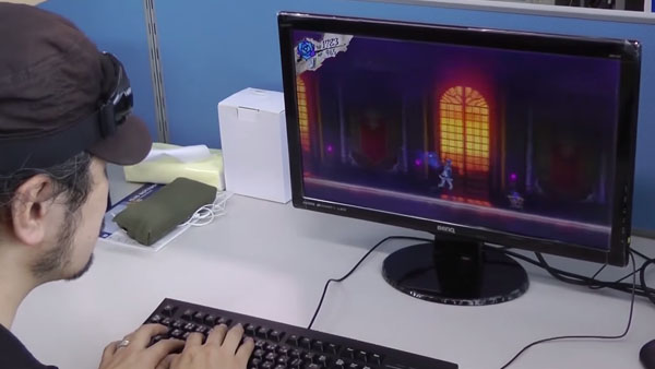
I haven't been able to download the demo. But I feel like these crappy youtube screenshots get the point across. The new look is hideous. Clearly something happened between last years e3 and now. Well going back further man, it used to look like this: 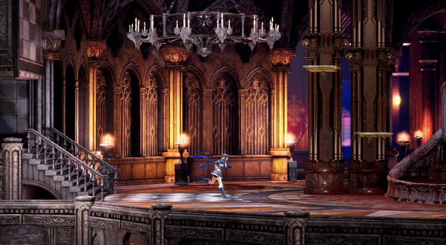 Granted the design of the room itself has changed now, the colors were amazing. Miriam herself looked better in these old shots than she currently does. The thing is, I don't know if this still image is her "model" or what they ended up using.  (open this image in a new tab, it's beautiful) Next: imgur.com/Pfdx797Click that link and zoom in - I've not seen Miriam that bright and nice looking since. Compared to  and They are not quite the same. My suspicion is that the original model wasn't rigged for mouth movement, for one thing. It's a downgrade overall. They simplified the model and lighting and downgraded the textures. It's really noticeable around her chest and torso: see how the belt straps are now all grey and also blurry, and the frills too. Parts that were made of actual polygons now seem to be made up of textures. This is a deliberate downgrade... my guess at this point is that they were working on an overspeced PC last year, and when it came time to consider the ports and the lower-end of the requirements, they realized it wasn't going to work and downgraded all of the assets before entering mass production... which, if they did, means there's no going back... and was something that should not have been done without notifying backers. |
|
dareka
Dhampyr
Loyal Familiar
Posts: 345
inherit
Dhampyr
1332
0
Mar 8, 2023 13:21:18 GMT -6
724
dareka
345
Jun 17, 2016 16:09:16 GMT -6
June 2016
dareka
|
Post by dareka on Jun 29, 2018 17:19:27 GMT -6
lovelydumpling freddythemonkey Ah.. I'd missed that comment... thanks... hopefully we'll get some answers, then, and my confidence in community-dev communication can be restored. But honestly, when I saw the comparisons of rooms inside the castle, it was pretty stunning ... it's like they took the trouble to make it look worse. Me smells a graphics downgrade to meet certain hardware specs... I hope I'm wrong... I'd gladly pay double what I did in the kickstarter for such a difference.
|
|
dareka
Dhampyr
Loyal Familiar
Posts: 345
inherit
Dhampyr
1332
0
Mar 8, 2023 13:21:18 GMT -6
724
dareka
345
Jun 17, 2016 16:09:16 GMT -6
June 2016
dareka
|
Post by dareka on Jun 29, 2018 17:07:42 GMT -6
Angel-Corlux commented earlier. He'll probably respond again at some point. Do you have a link to his comment? |
|
dareka
Dhampyr
Loyal Familiar
Posts: 345
inherit
Dhampyr
1332
0
Mar 8, 2023 13:21:18 GMT -6
724
dareka
345
Jun 17, 2016 16:09:16 GMT -6
June 2016
dareka
|
Post by dareka on Jun 29, 2018 16:49:01 GMT -6
If anything the older ones look more colorful to me. It seems like they made everything grey in the demo. All the reds and purples and some of the gold seems to be missing. And the windows in the background are all gone. Yup. It's all brighter and some of the colors are gone. I honestly have no idea why they would do this, but... even if they don't address it, if they don't at least acknowledge it and explain their reasoning, it might come back to bite them in the rear. The only reason I can think of for the downgrade is ... making the assets more amenable to Vita and Switch ports. I have no idea if this is actually the case. They have to communicate on this - but honestly, in the last few month's I've totally lost faith in the communication that was one of the better traits of this project. The fact that they preemptively said nothing on the issue is not particularly confidence inspiring. Did they really think, in this day and age, that nobody would notice? |
|
dareka
Dhampyr
Loyal Familiar
Posts: 345
inherit
Dhampyr
1332
0
Mar 8, 2023 13:21:18 GMT -6
724
dareka
345
Jun 17, 2016 16:09:16 GMT -6
June 2016
dareka
|
Post by dareka on Jun 29, 2018 15:34:59 GMT -6
lovelydumpling the short answer is yes, but the long answer is no, probably not. I was thinking of doing a separate thread on this, so as not to go off topic, but on second thought, just PM if you're interested in a more detailed explanation of why I think it won't happen. This doesn't mean there's no hope for improvement, though. CastleDan well, if that's the case, like I said, there's still hope, as they may yet change the lighting, probably without much trouble.
|
|
dareka
Dhampyr
Loyal Familiar
Posts: 345
inherit
Dhampyr
1332
0
Mar 8, 2023 13:21:18 GMT -6
724
dareka
345
Jun 17, 2016 16:09:16 GMT -6
June 2016
dareka
|
Post by dareka on Jun 29, 2018 12:59:32 GMT -6
I second this motion.
It would add a lot to the gameplay, making it both more varied and more fluid.
|
|
dareka
Dhampyr
Loyal Familiar
Posts: 345
inherit
Dhampyr
1332
0
Mar 8, 2023 13:21:18 GMT -6
724
dareka
345
Jun 17, 2016 16:09:16 GMT -6
June 2016
dareka
|
Post by dareka on Jun 29, 2018 11:27:43 GMT -6
The environments definitely blend together in the current game and the rooms don't look very creative. That first image in particular has always been a sticking point for me. There are a couple rooms that look nice, that blood red moon room for example, but yeah... the game really does look hollow and empty in most of its rooms. Personally, the only environment I felt was kind of underwhelming so far is the garden/inner courtyard. But I do understand what you guys are saying, and I think there's a reason for it. The interior of the castle is made to look spacious, as if you're in a large hall. The problem is this that, with highly detailed 3D graphics, this translates into the perception that there's a lot of empty space in the larger rooms, especially when you don't have a cave-like level design; notice how it also happens in the village, but not in the galleon, nor in the Japanese cave level they've shown. That's the trouble with 2.5D graphics: they give you more volume and detail, but because you're still moving in a 2D plane, everything feels emptier. The first image is a good example It looks less empty, right? That's because it's flatter. It's not a realistic looking room - there's no depth to it, it's just a straight hallway with windows in the background. Then again, this is how 2D games looked. They could have kept this look if they'd gone with a complete orthogonal projection - it's kind of hard to explain in layman's terms, but this means you have 3D models, but no depth to them. It robs them of a lot of detail and makes everything look 2D, but that's not necessarily a bad thing. As far as this image goes... The thing is, it's basically concept art: having this level of detail in real-time 3D might require increasing the specs quite a bit, especially if the lighting is done in real-time. Another thing is that the colors are really saturated. This certainly makes for pretty images, but it might tire your eyes after prolonged play, not to mention make Miriam and the enemies more difficult to see. That said, some this is an area where some tweaks to the lighting could go a long way. The devs are trying to balance visibility with appealing visuals, and that's very hard to do. |
|
dareka
Dhampyr
Loyal Familiar
Posts: 345
inherit
Dhampyr
1332
0
Mar 8, 2023 13:21:18 GMT -6
724
dareka
345
Jun 17, 2016 16:09:16 GMT -6
June 2016
dareka
|
Post by dareka on Jun 29, 2018 1:09:09 GMT -6
More playtime, more feedback... 1. The sign posts at the town (between the Minerva and the entrance to the town) look off because there's nothing written on them. They're shaped like arrows, but there's nothing written on the arrows, not even illegible text, and so they look phony. 2. I noticed something about the spiked coffin gimmick at edge of the courtyard section. Once you manage to have it snap shut without getting caught inside, you can move it, and it has a "being pushed" sound effect, right? Well, the effect happens whenever you push against it, regardless of whether or not it moves. So if you push it up against a wall, so long as you keep pushing against it you'll hear the sound effect of it "moving", even when it's not moving. I'm guessing this currently applies to all boxes in the game, and I think it would be best if you stopped hearing the sound once the object hits a wall.
3. When you upgrade a shard, it should say somewhere what the effect of the upgrade will be. Right now you only see their Attack value, but the upgrade doesn't necessarily increase it. For instance, enhancing Raging Gale seems to increase the size of the attack's hit-box, but you won't know that until you upgrade it and try it out. Considering that upgrading shards costs valuable resources (i.e, items), I would prefer to know the consequences of my actions before I decide how to spend those resources. 4. I mentioned this in the E3 community interview question thread, and it ended up not being covered, but... this game would really benefit from a toggle or shard that stops EXP point accumulation/Leveling. With the way IGAvanias traditionally work, you can't go through the game and keep your level at a minimum for maximum challenge, while at the same time accumulating rare weapons and items. Since these are drops, and drops require grinding, it follows that if you chose to grind for items, you'll end up leveling your character to the point the game becomes too easy. In Bloodstained, there's even more items to grind, especially with the crafting and alchemy system. The way things stand now, this means more unintended leveling, unfortunately. 5. Item drop bags. As lovelydumpling has noted, there's no blinking to tell you the bag's about to disappear; it just does. So blinking to let you know the bag's about to disappear would be nice, but so would having the bag immediately disappear once you grab the item. Right now it just stays there for a bit, open, and I still instinctively try to collect it even though I already have! |
|
dareka
Dhampyr
Loyal Familiar
Posts: 345
inherit
Dhampyr
1332
0
Mar 8, 2023 13:21:18 GMT -6
724
dareka
345
Jun 17, 2016 16:09:16 GMT -6
June 2016
dareka
|
Post by dareka on Jun 28, 2018 23:22:53 GMT -6
snip Angel, Question, whoever close to the team......I pray to the ARTPLAY and 505 GODS I made a feedback thread separate to this but something I want to bring special attention to.  If there's anyway to diminish that effect....or even get rid of it altogether I'd love that. To me not being able to see a part of your character as she runs through a scrolling environment is part of the immersion. To see her outline so clearly like that takes away from such immersion. I can't even think of many sidescrollers that do this let alone do it THIS clearly. So I beg of you......reconsider. Compared to most of my feedback issues this was a minor thing but man aesthetically it'd be so much better if that wasn't there. You're never behind an object that long for it to even be an issue to begin with. Even if it's important to the team maybe even an option to turn it off would be fantastic. I would much rather it be an option than removed entirely. For all I know it would be useful in some parts of the game. But at the same time I'd love to turn it off for screenshots or immersion's sake during areas where its not that big a deal, like right there. Now that you guys mention it, it is a bit jarring in some spots. File this one under the "a toggle would be nice" header. |
|